
Kelmscott Press
| Kelmscott Press | |
|---|---|
| legal form | Private printing |
| founding | 1891 |
| resolution | 1898 |
| Reason for dissolution | Death of the owner |
| Seat | Hammersmith , London |
| management | William Morris |
| Branch | Letterpress |

The Kelmscott Press was a private English printing company from 1891 to 1898 . It was founded by the English poet , politician and designer William Morris . With his demands for a beautiful book, this was the direction for the beginning of a new book culture and book art movement in England, which later also bore fruit in Germany.
background
Morris' preoccupation with book art
Morris spent a lot of time at the Bodleian Library while studying, studying ancient illuminated manuscripts and incunabula . He had a penchant for the medieval way of life and a keen interest in Gothic architecture and archeology . Medieval poets and their works, such as those of Geoffrey Chaucer , Jean Froissart or Thomas Malory , fascinated him throughout his life and served as role models for him. According to Albert Kapr, Morris therefore tied in "with the book art of the Renaissance, especially with the Venetian cradle prints ."
In Oxford he laid the foundations for his own valuable book collection, and his sense of style began to take shape. Dissatisfied with the structure of society, the social situation of the disadvantaged working class and the decline of the English arts and crafts, Morris looked for new social and artistic values and philosophical approaches. In addition to the writings of John Keats and Thomas Carlyle , those of the art historian John Ruskin played a special role in Morris's life. In Ruskin's publications, Morris found "reflections on the nature of art, the definition of beauty and its requirements."
For the publication of a magazine, Morris used a forgotten type , the Caslon , for the typography . From 1856 onwards, Morris worked intensively with calligraphy . His font style was based entirely on the era he revered. In later experiments he used the Antiqua . His works already showed rich book decorations here.
The situation of the English book market in the 19th century
The industrialization in the 19th century affected more and more the book productions and originally related arts and crafts. Cheap mass productions spread on the book market. The use of newly developed machines, such as the typesetting and printing machine , enabled a faster and cheaper production of the books, but at the same time led to an enormous loss of quality in terms of craftsmanship and art. Technical and commercial aspects gained the upper hand. Morris disliked inferior, thin paper, poor typography and typesetting of the entire text block, as well as bindings without design requirements.
Private printing houses such as Chiswick Press , small artisan businesses that had existed since the second half of the 19th century, initiated a reform and revival of book art. The high quality prints of the Chiswick Press, which kept the memory of the heyday of English printing, were known to Morris.
Established Kelmscott Press

Morris received the impetus to found his own printing company from his longtime friend Emery Walker . At the first exhibition of the " Arts & Crafts Exhibition Society " founded in 1888 , Walker gave a lecture on the history of printing. Morris had made books and manuscripts from his collection available to him and now saw the enlargements of these writings from the 15th century in the slide show. The beauty and perfection in the proportions of medieval scripts impressed him. He now developed the desire to design his own beautiful typeface and the idea of founding his own printing company. After the lecture he is said to have said: "Come on, Walker, let's design a new font!" In the literature November 15, 1888 is mentioned as the actual founding day of Kelmscott Press . The printer's first publication appeared in January 1891. Walker declined an offer to partner with Morris, but remained in contact with him as an important and important advisor.
On January 12, 1891, the Kelmscott Press began operations in Hammersmith , just two doors from Morris' Kelmscott House. The name Kelmscott for press and house was derived from the summer residence in the Cotswolds rented by Morris: Kelmscott Manor . In addition to Edward P. Prince as a type cutter, Morris hired William Bowden as a typesetter and printer. 53 prints appeared here at relatively short intervals within 8 years. Morris ignored the “modern” sense of style and chose the content of his books and their layout according to his own preferences.
Morris' demands for a beautiful book


In collaboration with Walker, Morris presented his book aesthetic principles and requirements for a beautiful book in writing in the annual journal of the "Arts & Crafts Exhibition Society" in 1893. The legibility of the scriptures was one of his most important requirements. He criticized the gray effect of the printed works of his time and called for a clear black and white contrast on the book page. This was to be achieved using letters with a clear line width (his first developed font was a Romanesque antiqua, the Golden Type , based on the font by Nicolas Jenson ), in contrast to the fashionable typesetting with linear, pointed serifs and strong differences in line width - and strokes of the hair ( classicist Antiqua such as Bodoni and Didot ). Furthermore, the distance between the words should be just large enough that the words can be clearly separated from each other. The line spacing should also be as small as possible in order to create a compact layout. In his considerations, he was inspired by medieval typography.
A minimum font size should be specified. He set the smallest font size at 12 pt ( Cicero ), but a size of 10 pt ( corpus ) could also be selected for small books . The goal must be a harmonious appearance.
The relationship between the text and its framing, the margins, should create a harmonious image. Another demand from Morris was that not only the single page of a book should be emphasized, but that the unity of the double page of the opened book should be observed.
In addition to the development of legible and beautiful writing, decorative book equipment should also enhance its beauty. The book decoration ( ornaments and illustrations ) should not overgrow the writing or be so pronounced that the reader would be distracted from the content of the book.
For the production of aesthetically pleasing books, the quality of the printing ink , the paper and the book cover were also important to him. The Kelmscott Press tried to restore "the unity of type and ornamentation, typesetting and image" and for Morris "any book could be a work of art if only the font is good and sufficient attention is paid to its overall design."
Printing practice
Paper and paint
Morris used paper made especially for him, an exclusively hand-made linen paper from the Batchelors paper mill in Kent . He also had special editions printed on thin parchment ( vellum ) and designed various watermarks that were intended to emphasize the quality of the paper in his books.
The printing ink common in England at the time left a blue or reddish undertone and did not meet Morris' desire for a strong black shade. After Walker brokered him, he obtained the printing ink from the Jaenecke company in Hanover. This custom-made ink caused difficulties with hand press printing because of its strength , but Morris managed to prevail over his co-workers and insisted on using them.
Fonts

Of the 53 prints, 24 copies and 9 new editions were printed with the first self-designed font by Morris, the "Golden-Type". The "Golden-Type" was named by Morris after the first print for which it was used: the " Legenda aurea " by Jacobus de Voragine after a translation by William Caxton . The typographical models for Morris included the Pliny edition by Nicolas Jenson and the writings of Jakobus Rubeus . Both worked in Venice in the 15th century. The "Golden Type" is an "Antiqua Type". With the design of the "Golden-Type" he tried to adapt the Antiqua to his requirements. As an advocate of the Gothic and with a preference for “bulky, compact fonts”, Morris tried “to combine the Italian elegance of Antiqua with the expressiveness of Gothic script”.
In the fall of 1891, Morris designed a Gothic font and tried to free it "from the charge of its illegibility". The result was the "Troy-Type"; a total of eleven prints were published using them. The first work printed with the "Troy-Type" was "The Recuyell of the Historyes of Troy", also based on a translation by William Caxton. As a model for the "Troy-Type", however, Morris did not choose the Textura , as was to be expected , but the Gotico-Antiqua , which was created under the influence of the Renaissance . Well-known masters, whose handwriting he used as a guide, were Rubeus and Jenson as well as Schöffer and Zainer .
With the downsizing of the "Troy-Type", Morris designed his third typeface, the "Chaucer-Type". “The Order of Chivalry” was the first book in 1892 to be printed with the “Chaucer-Type”.
Major editions

"The Story of the Glittering Plain" was published in May and the edition of 200 copies was sold out in June.
Probably the most important work of the Kelmscott Press was an 1896 edition of the works of Geoffrey Chaucer, the "Kelmscott Chaucer", including the Canterbury Tales . For almost five years, Morris, his friends and coworkers had been involved in the printing and equipment. Since 1892 Edward Burne-Jones tried to do the illustration, he designed 87 illustrations for this edition. Morris himself created more than 60 forms of book decorations, such as ornaments, initials , borders and the design of the title pages. The text ran in two columns on one side and was printed in red and black.
In addition to a design for the cover by Burne-Jones, Thomas Cobden-Sanderson took on the binding work. A total of 425 copies were printed on paper costing £ 20 and 13 on parchment costing 120 guineas .
Expansion of the printing works from 1891 to 1895
In November 1891 a second hand press was purchased. Three years later, another small house - No. 21, Upper Mall - rented, with a view of the river reflecting the light, so there was excellent lighting. In January 1895 a third hand press was added so that two printing presses could work exclusively for the "Chaucer" edition. Bookbinding was initially done by JJ Leighton, who used almost white leather. Morris preferred dark leather with pores still visible on the hair, and his editions got this leather. The silk cover was specially woven and dyed with red, blue, yellow and green colors.
The Chaucer edition printed 425 copies and sold for £ 20 each. Another 13 copies were printed on parchment and sold for 120 guineas (£ 126), and 48 were bound in white pigskin with silver clasps.
The 1896 Chaucer edition of Kelmscott Printers fetched £ 33,650 at Christie's auction on June 2, 2010.
After Morris' death
Morris died on October 3, 1896. He was unable to finish another fourth typeface. Towards the end of his life he had asked Emery Walker and Sidney Cockerell, his private secretary, if they would be willing to take over the printing business after his death. However, they said that this was Morris' work and should remain forever associated with his name.
The Kelmscott Press continued until 1898, when productions were completed. Charles Robert Ashbee then bought the Albion printing presses for his own Essex House Press and was able to win Thomas Binning as a valuable employee. Ashbee was keen to keep the Morris work in his print shop.
Design examples

The Nature of Gothic by John Ruskin , first page of text, 1897
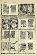
Examples of the arrangement of text and decoration
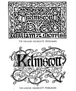
Two trademarks of the Kelmscott printing company
.jpg)


Reception and effect
On the importance of William Morris
“Morris did not create the modern book, but renewed the beautiful book, the ideal book, by resorting to the typographical laws that were found and developed in the 15th century and making them valid again. And these laws have been enforced again - that is his undeniable and lasting merit. "
Characteristic for the prints of the Kelmscott Press were the developed types, the illustrations in Pre-Raphaelite style, Gothic initials and wide borders. In total, Morris designed more than 600 samples for the Kelmscott Press for the rich decoration of his books.
Influence in England
A large number of private printing companies were founded as the direct successor to Kelmscott Press in England. This movement is called the Private Press Movement . For example, Emery Walker founded Doves Press with TJ Cobden-Sanderson , remained an important advisor to other printing companies and supported its founders. Just as Morris determined the image of his publications and was not influenced by the taste of the time, the founders of the new printing houses also designed the appearance of their editions and their contents according to their preferences. What all printing companies had in common was that the editions were mostly only published for a small group, for friends, acquaintances, family members or interested book lovers.
Examples to be mentioned here include the Doves-Press, the Ashendene Press , the Vale Press , the Eragny Press or the Essex House Press.
Influence in Germany

As in England, industrialization led to a separation between artists and the artistic relationship with their works in Germany. "Even before Morris' book art became known in Germany, artists had recognized the unsatisfactory situation in the German book industry and had already paved various paths towards reform." However, “it was not until the turn of the century that the life and importance of Morris were generally known in Germany”.
While a renewal of book art had begun in England under the influence of historical tendencies, the Munich Renaissance , with a few exceptions, did not go beyond the imitation of old prints and their copying. This is probably one reason why Morris and his works, with their clearly recognizable preference for Gothic, initially had no influence on the German book art movement.
The next generation of German artists was looking for new directions and for a liberation and turning away from copying historicism . In their search for a new style, they oriented themselves more towards Morris' successors such as Walter Crane , Aubrey Beardsley or Charles Ricketts .
After an illustrative-decorative period that began in Germany and the associated concentration on book decorations, there was a departure from illustrated books. The typography and its artistic function were now in the foreground, similar to the issues of the "Doves Press", in which the book decorations were reduced in favor of the typography and the communication of the content. Following Morris' example, with the minimization of the book decoration, there was again a concentration on the holistic understanding of the design of books.
Morris' influence on book art, his demand for a uniform design and the reunification of art and craft have been reinterpreted and implemented in the works of Joseph Sattler , Melchior Lechter , Heinrich Vogeler and Friedrich Wilhelm Kleukens , among others .
literature
- Eva – Maria Hanebutt – Benz: On the design of the Kelmscott Press books. In: Gutenberg Museum (Hrsg.): In search of the ideal book. William Morris and the Chaucer edition of Kelmscott Press from 1896. Mainz 1996, pp. 43–60.
- Joseph Riggs Dunlap: The road to Kelmscott. ( Dissertation ), New York 1972.
- Colin Franklin: Printing and the Mind of Morris. Cambridge 1986.
- Albert Kapr and Walter Schiller : Form and function of typography. VEB Fachbuchverlag Leipzig 1983, pp. 216-218.
- William Morris: A note by William Morris on his aims in founding the Kelmscott Press. Hammersmith 1898, ( online ).
- William S. Peterson: The Kelmscott Press. Oxford 1991, ISBN 0-19-812887-8 .
- William S. Peterson: The Kelmscott Press golden legend. College Park 1990.
- William S. Peterson: A bibliography of the Kelmscott Press. Oxford 1984, ISBN 0-19-818199-X .
- Will Ransom (et al.): Kelmscott, Doves and Ashendene. Los Angeles 1952.
- Henry Halliday Sparling: The Kelmscott Press and William Morris, master-craftsman. MacMillan & Co. London 1924, ( online ).
- Aymer Vallance: The art of William Morris. London 1897. ( online )
- Printing. An essay by William Morris & Emery Walker. in: Arts & crafts essays by members of the Arts and Crafts Exhibition Society. 1903, ( online ).
- swell
- Michaela Breasel: The “Private Press Movement”. In: Gutenberg Museum (Hrsg.): In search of the ideal book. William Morris and the Chaucer edition of the Kelmscott Press from 1896. Mainz 1996, pp. 61–62.
- Hans Eckert: William Morris and the Kelmscott Press: The Works of Geoffrey Chaucer 1896–1996. In: Gutenberg Museum (Hrsg.): In search of the ideal book. William Morris and the Chaucer edition of Kelmscott Press from 1896. Mainz 1996, pp. 15–33.
- Hans-Christian Kirsch: William Morris - a man against time. Cologne 1983, ISBN 3-424-00772-2 , p. 25; Pp. 55-63; Pp. 228-246.
- Friedrich Adolf Schmidt-Künsemüller: William Morris and the newer book art. Carl Wehmer (Hrsg.): Contributions to the book and library system. Volume 4, Wiesbaden 1955, pp. 22-43.
- The ideal book. In: William S. Peterson (ed.): The ideal book. Essays and lectures on the art of the beautiful book by William Morris. (Translated by Norbert Selting) Göttingen 1986, pp. 69-76.
- William Morris on the goals he pursued in founding Kelmscott Press. In: William S. Peterson (ed.): The ideal book. Essays and lectures on the art of the beautiful book by William Morris. (translated by Norbert Selting) Göttingen 1986, pp. 77-80.
Web links
- Canterbury Tales on wally.rit.edu
- Designs and book list by William Morris ( February 20, 2001 memento on Internet Archive )
- "Golden-Type", "Troy-Type" and "Chaucer-Type" on klingspor-museum.de (PDF file; 970 kB)
- Collection of the Klingspor Museum on klingspor-museum.de
- Printed by the Kelmscott Press at special.lib.gla.ac.uk
- Morris and Chaucer, The Burne-Jones Illustrations for the Kelmscott Chaucer at victorianweb.org
- The List of Books printed by Kelmscott Press at archive.org
- The staff of the Kelmscott Press on npg.org.uk, in the National Portrait Gallery (the glass plate is damaged)
- Kelmscott Special Collections from the University of Glasgow at special.lib.gla.ac.uk
- An “Albion” hand press in the Court Barn Museum on williammorrissociety.org
- William Morris, initial D, a design for a woodcut on britishmuseum.org, England, AD 1890-96 British Museum.
- Kelmscott Chaucer in the British Library's online gallery
Individual evidence
- ^ Albert Kapr : Schriftkunst, 1971, p. 206
- ↑ Hans-Christian Kirsch: William Morris - a man against time. P. 59.
- ↑ Hans-Christian Kirsch: William Morris - a man against time. P. 231.
- ↑ St. Augustine: De civitate Dei . Publisher: Nicolas Jensen, Venetiis 1475
- ↑ Hans-Christian Kirsch: William Morris - a man against time. P. 235.
- ↑ The Ideal Book. In: William S. Peterson (ed.): The ideal book. Essays and lectures on the art of the beautiful book by William Morris. P. 70 ff.
- ↑ The Ideal Book. In: William S. Peterson (ed.): The ideal book. Essays and lectures on the art of the beautiful book by William Morris. P. 72.
- ↑ Friedrich Adolf Schmidt Künsemüller: William Morris and the newer book art. P. 43.
- ↑ The Ideal Book. In: William S. Peterson (ed.): The ideal book. Essays and lectures on the art of the beautiful book by William Morris. P. 69.
- ↑ Friedrich Adolf Schmidt Künsemüller: William Morris and the newer book art. Pp. 27/28.
- ↑ Hans-Christian Kirsch: William Morris - a man against time. P. 239.
- ↑ The Order of Chivalry: “The Order of Chivalry,” “Le Ordenè de Chivalerie,” and the “Ordination of Knighthood” on morrisedition.lib.uiowa.edu
- ^ William Morris: The story of the Glittering Plain which has also been called the Land of Living Men or the Acre of the Undying . Ornamented with 23 pictures by Walter Crane. Printed at the Kelmscott Press 1894.
- ↑ Kelmscott Chauer in the online Gallery of the British Library
- ↑ KELMSCOTT PRESS-CHAUCER, Geoffrey. The Works. Edited by FS Ellis. Hammersmith: Kelmscott Press, 1896.
- ^ Essex House Press. In: Arts and Crafts Museum. Cheltenham Art Gallery and Museum, accessed January 17, 2013 .
- ↑ Friedrich Adolf Schmidt Künsemüller: William Morris and the newer book art. P. 35.
- ↑ Michaela Breasel: The “Private Press Movement”. P. 61.
- ↑ Friedrich Adolf Schmidt Künsemüller: William Morris and the newer book art. P. 96.
- ↑ Friedrich Adolf Schmidt Künsemüller: William Morris and the newer book art. P. 109.