
Gotico-Antiqua


Gotico-Humanistica or Gotico-Antiqua denote in palaeography or (paleo-) typography fonts or fonts that represent mixed forms between the broken , "Gothic" script and the humanistic minuscule or antiqua that emerged in Italy during the Renaissance period .
This script was initially written by hand and then as well as along the lines of these manuscripts typeface cut. It flourished briefly in early book printing in the second half of the 15th century. In the first two decades of the incunable period it was the predominant script of many office workers . It was used for Latin texts, but also for vernacular languages. It is considered the first bread script - the first type with which typesetters earned their "daily bread". Then the font class fell out of use.
The type repertory of the incandescent prints of the Berlin State Library assigns around 200 specific print types to the Gotico-Antiqua.
Designations
In Latin, broken script (whether handwritten or printed) is called scriptura gotica . The writing of Francesco Petrarch and his successors is called scriptura fere humanistica (almost humanistic writing), semigotica or gothica-praehumanistica . From it the humanistic minuscule developed , but also mixed forms of broken and humanistic script, which are called Gotico-Humanistica as handwriting .
In print the humanistic minuscule became an antiqua . In 1923 , Alfred Hessel coined the name Gotico-Antiqua in his essay From writing to printing as the name for the typeface class, which corresponds to Gotico-Humanistica . The German literature on the subject also contains the alternative spellings Goticoantiqua , Gothico-Antiqua , Gothicoantiqua and Gotica-Antiqua . In English, the script is called gotico-roman , gothico-roman or gothic antiqua .
history
origin
The Gotico-Humanistica has its predecessors in humanistic manuscripts from the 14th century from Italy, especially in the "Petrarca script". It developed parallel to the humanistic minuscule in the 15th century.
With the invention of letterpress printing by Johannes Gutenberg from 1450 in Mainz , the manuscripts customary in the region at the time, including the Gotico-Humanistica, were adapted for letterpress printing. These are the Gotico Antiqua fonts.
In both areas there was a great variety of shapes and little standardization.
The heyday of letterpress printing
The first printer to use a Gotico Antiqua type was Peter Schöffer . In 1459 he printed the Rationale divinorum officiorum by Durandus von Mende in Mainz and in 1462 the Fust Schöffer Bible . Another early incunable set in a Gotico-Antiqua is the Catholicon , which, according to its colophon, was first printed in Mainz in 1460 . Its printer is not secured, it could possibly be Johannes Gutenberg . The Mentelin Bible by Johannes Mentelin, published in 1466, is also set in a Gotico-Antiqua, as is the first print of the Parzival by the same printer in 1477 .
The better legibility of the Gotico-Antiqua compared to the Textura made it possible to print in smaller font sizes . This has increased the number of possible lines per page, reduced the number of printed pages in a book and reduced costs.

The Gotico-Antiqua was not only used in letterpress printing, but also occasionally for inscriptions , for example on the grave slabs of the Passau stonemason Jörg Gartner or in the choir stalls of the Ulm Minster (1469–1474). Overall, however, it only plays a subordinate role in epigraphy .
In Italy , the Antiqua, which was first used there in print, and the Gotico-Antiqua were used in parallel for some time. In German-speaking countries, an antiqua was first used in 1474 in a print by Adolf Rusch . However, the Antiqua did not compete with the Gotico Antiqua.
In France , the Gotico-Antiqua only played a minor role for a short time, as did in England .
The End
In Italy, both the Antiqua and the Gotico-Antiqua were pushed back by the Rotunda in letterpress printing from the 1470s . Towards the end of the 1480s the antiqua came into greater use again, but not the gotico antiqua. In the 16th century, the antiqua finally became the predominant script alongside the antiqua cursive and is still used today. The Rotunda was able to hold its own in Italy and other countries for longer, while the Gotico-Antiqua became de facto extinct.
In Germany, the Gotico-Antiqua that had prevailed there until now was superseded by other fonts a little later, from around the year 1480. The rotunda was preferred for Latin texts and bastards for German texts . From around the year 1500 the Gotico-Antiqua was hardly used anymore. This situation lasted until around the 1520s, when in Germany the rotunda was again replaced by the antiqua for Latin texts; The Schwabacher , Oberrheinische Type and Wittenberger script were increasingly used for German texts, and in the long term the Fraktur prevailed. In the German-speaking world, this resulted in a parallel use of broken script for German texts and Antiqua for foreign language and for distinction (see Fraktur sentence # Antiqua ). This parallel use of two font classes finally culminated in the antiqua-Fraktur dispute .
features
In the Gotico-Humanistica the typeface is often based on the Semigotica. The forms correspond mainly to those of the Textura or the Gothic cursive , but individual letters are taken from the humanistic minuscule.
In the early days of book printing there was a broad transition field from mainly Gothic fonts with traces of humanistic elements to "pure" Antiqua fonts with diverse hybrid forms in between. Therefore, the characteristics of the font class can only be roughly outlined. In the Gotico-Antiqua the letters are still based on the textura in their construction and their strong line width , however the arcs are less broken and the letters less narrow, so that the typeface is easier to read and creates an impression similar to the Antiqua. It has these features in common with the round Gothic script, which also has its roots in Italy. As a mixed form, it is sometimes called a bastard font, but it is not a bastarda .
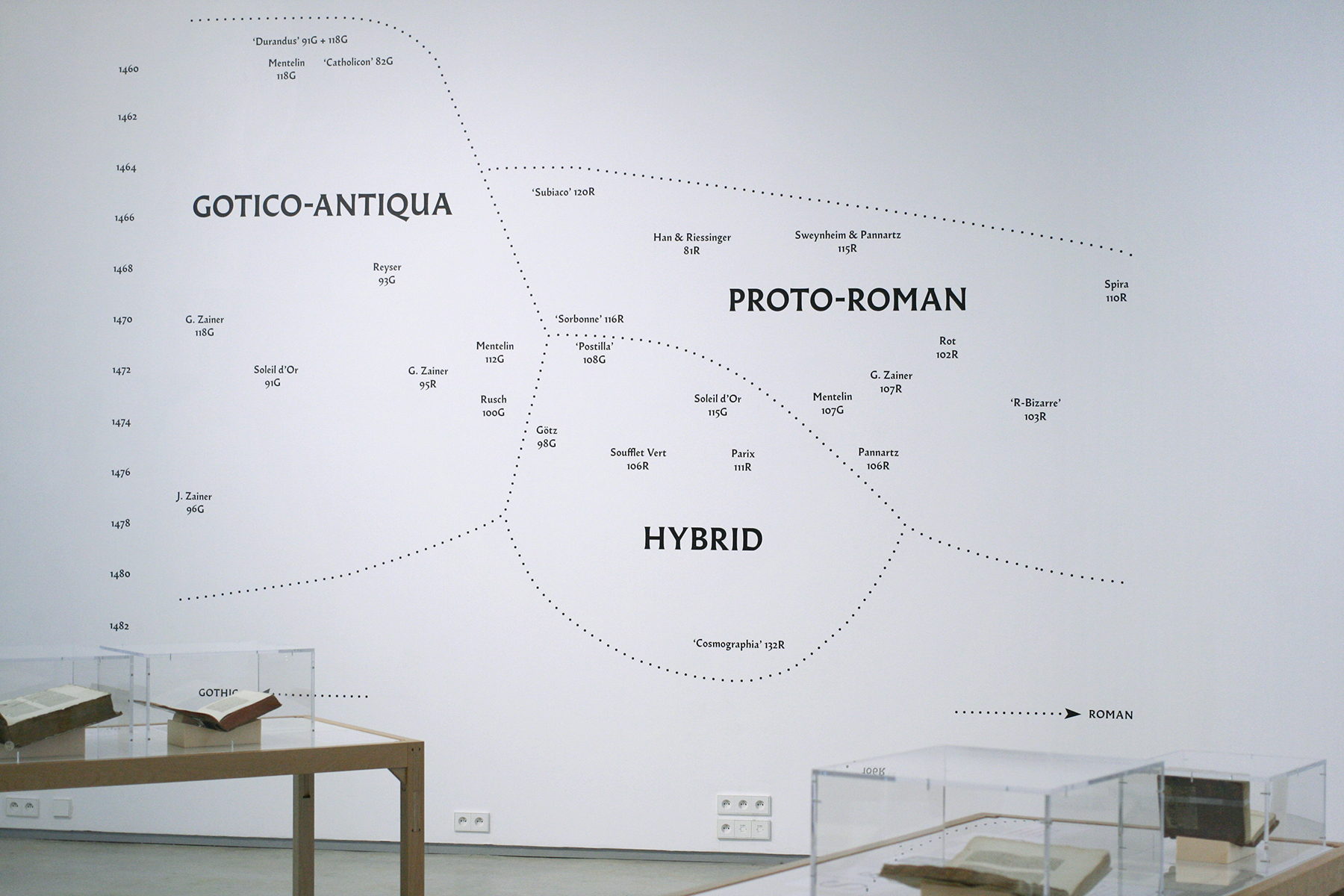
The typeface designer Jérôme Knebusch uses the following classification scheme: in addition to the Gotico-Antiqua, which for him describes fonts from the transitional field that are closer to the Gothic script, he speaks of the Proto-Roman class , which is closer to the Antiqua, and of one later class that emerged around 1471, which combines the properties of both and which he calls hybrid .
Resurgence in the English book art movement
The English poet and designer William Morris implemented his own book aesthetic ideas in the 1890s, trying to "combine the Italian elegance of Antiqua with the expressiveness of Gothic script". He designed his own typefaces for his private printing company Kelmscott Press , the design of which was based on the Gotico-Antiqua models of masters such as Jakobus Rubeus , Nicolas Jenson , Peter Schöffer and Günther Zainer : the "Troy-Type" and the "Chaucer-Type" .
literature
- Alfred Hessel: From writing to printing . In: Journal of the German Association for Books and Literature . tape 6 . German Book Museum, 1923.
- Ramona Epp: An epigraphic minuscule between the Middle Ages and modern times: the Gotico-Antiqua in the inscriptions . In: Archives for Diplomatics, History of Writing, Seals and Heraldry . tape 47/48 . Münster, Cologne 2001, p. 167-221 .
Web links
- gotico-antiqua . Publications in the bibliographic database of the Regesta Imperii .
Individual evidence
- ↑ a b c Christina Killius: The Antiqua-Fraktur Debate around 1800 and its historical derivation . Harrassowitz Verlag, Wiesbaden 1999, ISBN 978-3-447-03614-6 , pp. 37 ( books.google.de ).
- ↑ TW - Type search results. In: staatsbibliothek-berlin.de. tw.staatsbibliothek-berlin.de, accessed on May 20, 2020 .
- ↑ Christina Killius: The Antiqua Fraktur Debate around 1800 and its historical derivation . Otto Harrassowitz Verlag, 1999, ISBN 978-3-447-03614-6 , p. 33 ( books.google.de ).
- ↑ a b codices.ch. In: codices.ch. Retrieved June 4, 2020 .
- ^ Alfred Hessel: From writing to printing . In: Journal of the German Association for Books and Literature . tape 6 . German Book Museum, 1923.
- ^ A b Dietmar Strauch, Margarete Rehm: Lexicon book - library - new media . KG Saur Verlag, Munich 2007, ISBN 978-3-11-092121-2 , p. 198 ( books.google.de ).
- ↑ a b c Marion Janzin, Joachim Güntner: The Book of the book: 5000 yearbook story . 3. Edition. Schlütersche Verlagsanstalt, Hanover 2007, ISBN 978-3-89993-805-0 , p. 180 ( books.google.de ).
- ^ Ernst Crous: The Gothic fonts in book printing . In: Ernst Crous, Joachim Kirchner (Ed.): The Gothic fonts . Klinkhardt u. Biermann, 1970, p. 27–39 , here p. 34 ( digital.slub-dresden.de ).
- ↑ Franz-Albrecht Bornschlegel and Ramona Epp: The written forms : In: The inscriptions of the city of Passau up to the city fire of 1662 , edited by Christine Steininger with the assistance of Franz A. Bornschlegel, Egon Boshof , Arnim Eich, Josef Engelberger, Ramona Epp, Werner Hechberger , Friedrich Ulf Roehrer-Ertl, based on preliminary work by Klaus Ulrich Högg. Wiesbaden 2006 (= Die Deutsche Insschriften 67), pp. XXXIII – LVII, here especially pp. XLV – LI ( inschriften.net ); see. also the advertisement in the German Archive 65 (2009) 1, pp. 283–284 ( digisites ).
- ↑ a b c Harald Drös: The inscriptions of the district of Göppingen . Dr. Ludwig Reichert Verlag, 1996, ISBN 978-3-88226-870-6 , p. lv ( books.google.de ).
- ↑ Symposium for Latin Epigraphy of the Middle Ages and Modern Times (1, 1980 Landshut): Symposium for Latin Epigraphy of the Middle Ages and Modern Times: Landshut, 18.-20. July 1980 . M. Lassleben, 1982, ISBN 978-3-7847-4419-3 , p. 27 ( books.google.de ).
- ^ Ernst Crous: The Gothic fonts in book printing . In: Ernst Crous, Joachim Kirchner (Ed.): The Gothic fonts . Klinkhardt u. Biermann, 1970, p. 27–39 , here p. 30 ( digital.slub-dresden.de ).
- ^ Ernst Crous: The Gothic fonts in book printing . In: Ernst Crous, Joachim Kirchner (Ed.): The Gothic fonts . Klinkhardt u. Biermann, 1970, p. 27–39 , here p. 31 ( digital.slub-dresden.de ).
- ^ Ernst Crous: The Gothic fonts in book printing . In: Ernst Crous, Joachim Kirchner (Ed.): The Gothic fonts . Klinkhardt u. Biermann, 1970, p. 27–39 , here p. 29 f. ( digital.slub-dresden.de ).
- ^ Ferdinand Geldner: Incunabulum. An introduction to the world of the earliest book printing (= elements of the book and library system . Volume 5 ). Reichert, Wiesbaden 1978, ISBN 978-3-920153-60-5 , pp. 57 ( books.google.de ).
- ^ Ernst Crous: The Gothic fonts in book printing . In: Ernst Crous, Joachim Kirchner (Ed.): The Gothic fonts . Klinkhardt u. Biermann, 1970, p. 27–39 , here p. 36 ( digital.slub-dresden.de ).
- ↑ Wolfgang Beinert: Rotunda - half-Gothic script (script classification). In: typolexikon.de. 2017, accessed on June 4, 2020 (German).
- ↑ a b Jérôme Knebusch: Gotico-Antiqua, Proto-Roman, Hybrid. 15th century types between gothic and roman. In: fontsinuse.com. Fonts in Use, 2019, accessed May 19, 2020 .
- ↑ Graphics
- ↑ Friedrich Adolf Schmidt Künsemüller: William Morris and the newer book art. Otto Harrassowitz, Wiesbaden 1955, pp. 27-28.