Swing (writing)

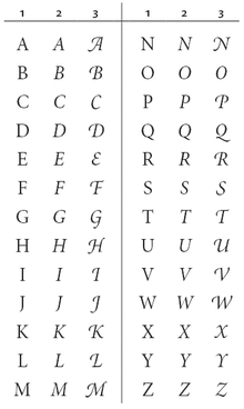
Swings and flourishes are decorative decorations on letters or glyphs , which are intended to give the typeface special ornament, dynamism or elegance. They exist in handwriting, especially cursive fonts and calligraphy , but also in typography and the design of logos .
Conceptual
The word swing refers to the movement of the hand while writing in the sense of "a quick, arched movement". The word curlicue etymologically refers to a snail (nlinie) or loop and describes a sinuous line that should serve as an ornament.
The use of curves or squiggles is on the one hand artful, on the other hand it also has negative connotations - for example because legibility can suffer as a result - and is then referred to as "squiggles" or "squiggles". The adjective "squiggled" can refer to writing, but also to handicrafts such as blacksmiths or carpentry , and metaphorically to completely different things such as music or linguistic formulations. The adjective "no frills" describes the restriction to the essentials.
In English, curved ornamental lines of all kinds are commonly called flourish in calligraphy . Certain types of flourishes can be further identified using terms such as swirls , swoops, and swashes . In the field of typography, the term swash refers to decorative lines that are an integral part of a glyph, as well as to decorative forms of a glyph. Decorative lines that are not connected with glyphs, on the other hand, are not referred to as swash , but only as flourish .
General
In principle, every stroke of a letter or any other glyph can be lengthened, enlarged or otherwise changed to form a curve: upward and downward strokes, shafts , diagonals, cross lines, tails. Additional strokes can also be added for turns. Swings can show the order in which two lines are set by not putting the feather down. Swings can also connect two letters, although in calligraphy these do not necessarily have to be adjacent (as in ligatures ), but can even belong to different words or lines if the calligrapher likes it.
When it turns, letters often exceed their usual space. In calligraphy, exceeding space can be extreme. In typography, it is usually more moderate, for example by making a glyph wider or giving it a descender that it would otherwise not have.
Swings are more common in capital letters, but also in lower case letters.
Swings (flourishes) in the handwriting

Swings (flourishes) come from the handwriting . They can be found very early on, for example in the signature of Pippin the Younger (714–768).
In calligraphy, they are stylistic elements that the writer uses or does not use at his discretion. They require practice and skill in order to achieve the desired shape and precision in spite of the quick and sweeping movement of the pen (or other writing instrument).
Large swings can be very dominant and dominate the entire typeface. Swings that take up space require that the letter has the necessary free space in its surroundings, provided that one wants to avoid overlapping with other characters. They are therefore found particularly often in headings, at the beginning of a sentence, at the end of a sentence, in the first line of a paragraph (up) or in the last line of a paragraph (down). Swings are also very popular in signatures . Some signatures consist almost entirely of swings.
There are swings in broken manuscripts (such as Bastarda and the German Kurrent script ) as well as in Latin script . In calligraphy, this stylistic feature began to get out of hand in the middle of the 17th century: the swings became more and more virtuoso and often became independent into opulent feather games.
Swings in typography

Swings found their way from handwriting to typography. In typefaces swings are occupied at least since the 16th century. They are found for example in Ludovico degli Arrighi Vicentino La Operina from the year 1522. Arrighi style influenced font Schneider in Italy and especially in France.
In early typography, large curves were sometimes added by hand after printing in order to give the book the appearance of a valuable handwriting, for example in Theuerdank (1517).
Otherwise, from the font cutters own typefaces for swash characters (also Zierbuchstaben ) (English: swash letters ) made having with respect to its usual form, one or more of the following changes in features:
- Lines are enlarged or lengthened,
- additional strokes are added that start at serifs ,
- The strokes of the glyph are made curvier and more cursive, whereby serifs can be omitted.
In a font with swash letters there is by no means always a swash letter variant for each letter, but often only for individual selected letters.
Basically, the typesetter is far less flexible than the calligrapher with swash letters. These swing letters are only used for the first and last letters of words or sentences, never inside the word, that would be a stylistic error. This also applies to capital letters . As a rule, they are not used in the middle of text bodies , but in headings, at the beginning or at the end of a paragraph.
Definition of terms
While swash letters are special variants in their own font styles, the usual letters of a font can already have swash shapes. This can be a “tail” swung far to the right below in an Antiqua-Q, or swings in the uppercase of broken fonts or cursive fonts. In this case one speaks at best of micro-typographical curves or curved shapes, but not of typesetting of curved or ornamental letters, since there are no special variants.
Fonts (examples)
Serif fonts
Swash letters are often found in serif fonts. Within a font family , they are usually only available as variants for the italic style, and more rarely also for the non-italic normal style. In OpenType - fonts you swashes can activate by menu control.
Fonts with swash letters are for example:
- in the French Renaissance Antiqua class :
- in the Baroque Antiqua class :
- Variants of the Caslon
- Baskerville (Baskerville's original script contained swash letters at the J, N, Q and T. Some recuts have removed these while other recuts have added more swash letters. Mrs Eaves has a particularly large number.)
- Bookman (typeface) in styles from 1903 (“Bookman Old Style”) and especially in styles from the 1960s and 1970s, when swash letters became very popular.
- in the Classical Antiqua :
Broken Fonts
In broken fonts , curves are a popular decorative element, especially with capital letters. They can be found in the standard forms of capital letters, i.e. not as special capital letters. For example, a certain curve called " elephant trunk " is a typical decorative element in Gothic script .
Sans serif
The sans serif swash characters are rarer. Examples are:
- Semplicità (around 1928)
- Tempo (1930)
- Helvetica Flair (a particularly heavily criticized design that combined the very sober Helvetica with ornate curves in the style of the 1970s, a clash of contradicting elements)
- Mr Eaves , a sans serif version of Mrs Eaves
Cursive fonts
There are often swings in typographic scripts . In calligraphic-inspired cursive fonts, the capital letters in particular often have swings in their regular style. This is quite possible because the form of capital letters is rarely used in conjunction with cursive fonts and therefore the capital letters are usually only at the beginning of the word. There are also typographic scripts with special swash letters. Examples of this are the Zapf Chancery and Zapfino by Hermann Zapf .
Swings in logos
Curves are also used in the lettering of logos . The graphic designer can exceed the limits of the typesetter and orientate himself freely on calligraphic swing possibilities. Swings are popular in the beginning and end letters, as well as in any letters (also inside the word) that have an ascender or descender length or are given one by a swing. They are well suited to leave the boundaries of a system of lines , to fill empty space or to underline or underline the brand name. They can convey dynamism, playfulness or elegance.
Probably the world's best-known example is the Coca-Cola logo , which has a distinctive curve in the two letters C.
literature
- Dan X. Solo: Swash Letter Alphabets: 100 Complete Fonts . Courier Corporation, 1996, ISBN 978-0-486-29332-5 ( books.google.de ).
Web links
Individual evidence
- ^ Heinrich August Pierer: Universal lexicon of the present and the past: or, Latest encyclopedic dictionary of the sciences, arts and trade, edited by more than 220 scholars . HA Pierer, 1845, p. 88 ( books.google.de ).
- ↑ Duden editorial office: Duden - German as a foreign language - standard dictionary: The dictionary for everyone who learns German as a foreign language . Bibliographisches Institut, 2018, ISBN 978-3-411-91257-5 , pp. 850 ( books.google.de ).
- ^ Bill Hildebrandt: Calligraphic Flourishing: A New Approach to an Ancient Art . David R. Godine Publisher, 1995, ISBN 978-1-56792-028-4 , pp. 1 ( books.google.de ).
- ↑ Alissa Chojnacki: Fearless Flourishing: A Step-by-Step Workbook for Embellishing Your Hand Lettering with Swirls, Swoops, Swashes and More . Simon and Schuster, 2019, ISBN 978-1-61243-888-7 ( books.google.de ).
- ↑ Rebecca Hagen, Kim Golombisky: White Space is Not Your Enemy: A Beginner's Guide to Communicating Visually Through Graphic, Web & Multimedia Design . Taylor & Francis, 2013, ISBN 978-0-240-82414-7 , pp. 106 ( books.google.de ).
- ^ Daniel Palacios: Tips for Adding Ligatures and Swashes to Your Lettering. In: highpulp.com. 2016, Retrieved July 17, 2020 (American English).
- ^ Bill Hildebrandt: Calligraphic Flourishing: A New Approach to an Ancient Art . David R. Godine Publisher, 1995, ISBN 978-1-56792-028-4 , pp. 2 ( books.google.de ). , Fig. 1, Example 11.
- ^ Gavin Ambrose, Paul Harris: The Fundamentals of Typography . Bloomsbury Publishing, 2006, ISBN 978-2-940439-97-3 , pp. 96 ( books.google.de ).
- ↑ Lucas Materot: Les œvre. Avignon 1608. ( In the digital offer of the Bibliothèque nationale de France, département Réserve des livres rares )
- ↑ Adobe Type Library Reference Book , 3rd Edition, Adobe Systems, 2007.
- ↑ Alexander Lawson: Anatomy of a Typeface . David R. Godine, 1990, ISBN 978-0-87923-333-4 , p. 91.
- ↑ Swash letters. In: typografie.info. Typografie.info, accessed on July 17, 2020 (German).
- ↑ Ulrike Seeberger: Routledge German Dictionary of Information Technology . Psychology Press, 1996, ISBN 978-0-415-08646-2 , pp. 205 ( books.google.de ).
- ↑ a b capital letters. In: typografie.info. Typografie.info, accessed on July 16, 2020 (German).
- ↑ Andrew Wolson: Baskerville . Retrieved September 1, 2014.


