
Splash
The Pflatsch is the nickname for the logo of the Austrian Federal Railways between 1974 and 2004. It replaced the ÖBB impeller and was replaced by the ÖBB word mark .
history


introduction
In a competition held in 1971, this logo won from several submissions. After a few attempts with regard to placement and size, it became mandatory for newly delivered and fully inspected vehicles from autumn 1974. The onomatopoeic term arose because, in contrast to the impeller, this large logo appeared like a smacked spot.
Jaffa livery
The introduction of the Pflatsches went hand in hand with that of the so-called Jaffa painting , which began in 1970. This was the change of the color for locomotives and passenger cars to blood orange ( RAL 2002 ). Therefore, the basic color of the logo on a light background (for example white, light gray, ivory or yellow) was initially not red, but orange. The white signet was applied to a dark background (e.g. blue, green, brown, red or orange).
For the first time, not only locomotives, but also all wagons bore the railway logo. The Pflatsch was usually centered on the front of locomotives and railcars, on the side walls of locomotives next to the right door, on passenger cars usually under the first or second window from the right and on freight cars on the car body on the right (or on flat cars partially on one specially attached board). Some locomotives delivered from the 1990s had a particularly large white patch on the side walls on the side walls: on the 1822 on the left, on the 1012 centered and on the 1016/1116 on the right.
The first new delivery with Pflatsch and Jaffa paintwork was the 1044.01 electric locomotive .
Valousek paintwork
With the introduction of the ivory / red Valousek paintwork (named after the designer Wolfgang Valousek) at the beginning of the 1990s, the Pflatsch also turned red on a light background (e.g. ÖBB 4010 ).
With the introduction of the Pflatsch company logo, further changes in the design of the ÖBB went hand in hand: for example, station signs (white to ultramarine blue with rounded corners) and company addresses were changed to the Helvetica font in semi-bold and the class numbers 1 and 2 were written much larger than before. Also were pictograms introduced.
End of the flop, introduction of the word mark

Since the logo was well known in Austria , but not abroad, the ÖBB introduced the word mark from 1998, initially in black or gray together with the Pflatsch and only in print products and online . From around 2001 this combination could be seen on some new or modernized vehicles. As early as 2003, the word mark was used alone on new or modernized vehicles, usually in white (or in red on a light background). With the introduction of the ÖBB word mark, the light blue station signs with white frames and rounded corners as well as the pictograms at stations and on trains were replaced by angular, dark blue signs.
Naturally, the changes in the stations and vehicles took a few years, so that the Pflatsch and the old station signs can still be found at smaller stations and signposts as well as on older locomotives and railcars. With the renovation of the door handles and headlights in 2017 and 2018, the logos on many locomotives and push-pull trains decorated with Pflatsch were also swapped. However, the old logo was still attached to some vehicles after the modifications.

The old logo is still used on the signs to the train station for new installations, although the road traffic regulations already provide for a neutral symbol (this is mainly used in places where a private railway company also uses the train station). In some communities, the Pflatsch was pasted over with the word mark.

Railcar 4020 229 with Pflatsch, Vienna Matzleinsdorfer Platz , May 2012

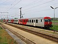
4020 261 with word mark in Kornneuburg in addition to continuing with slop provided 1144 117, November 2017

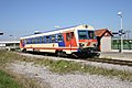
ÖBB 8073 with Pflatsch in Zell am See , July 2014

Control car series 8073 with word mark in Herzogenburg , February 2018

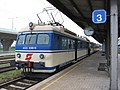
ÖBB 5047 with Pflatsch at Groß-Schweinbarth station , September 2013

DMUs 5047 048 with word mark in Herzogenburg , February 2018

_%C3%96BB_4020_261-6_and_%C3%96BB_1144_117-9_at_Bahnhof_Korneuburg.jpg)

_50_81_80-73_209-3_at_Bahnhof_Herzogenburg,_Austria.jpg)

_Bahnhof_Herzogenburg.jpg)
Since there is no other official name for this logo, the name has established itself among railway workers and is also used for classification in model descriptions by model railway manufacturers. The use of the word has increased significantly since the introduction of the word mark, as there are now three possible logos for ÖBB locomotives.
gallery
The splash on objects
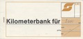
Splat on the cover of the former kilometer bank , 1989

Sticker at Bad Hofgastein train station with black patch. This refers to the Austrotakt from 1982.

Commemorative plaque “150 Years of the Railway” at Wolkersdorf station , July 2008

Pflatsch at Bad Sauerbrunn train station , August 2008

Access to Vienna Penzing train station , March 2009
No longer existing signpost to the Kranebitten stop , October 2012

Pflatsch at Mürzzuschlag train station , July 2014

Pflatsch at Vienna Floridsdorf train station , already replaced by a word mark, August 2017

Devotional sign at Markersdorf an der Pielach train station, October 2017

Pflatsch at the Vienna Spittelau transport station , September 2018

Old clock with brown paws at Schwarzach-St. Veit , December 2018

A white plump on a red background, on an old bench at the Saalfeldner Bahnhof, February 2019

Old "Bahnzeit" clock with a blue patch at Werfen train station , February 2019

The Pflatsch and the word mark-Pflatsch combination on a station clock in front of the Franz-Josefs-Bahnhof in Vienna , February 2019

Pflatsch on an old Wiener Linien sign , Heiligenstadt underground station , February 2019

The Pflatsch and the word mark of the ÖBB , still present on the doors of the CityShuttle sets, March 2019

Pflatsch on an entrance platform of the Purkersdorf Zentrum Bahnhof, May 2020


.jpg)
_Edification_shield_at_Bahnhof_Markersdorf_an_der_Pielach.jpg)
.jpg)


The splash on vehicles

ÖBB 1018 .07 at Attnang-Puchheim station , August 1980

ÖBB 1044 with old Eurofima wagons in C1 livery at Sankt Pölten Central Station , August 1988

ÖBB 6020 as S45 at Vienna Hütteldorf station , August 1988

ÖBB 2143 at St. Pölten main station with Schlieren car , summer 1995
ÖBB 1012 with Pflatsch in red at the Vienna Südbahnhof , June 1997
ÖBB 4030 as S40 at Vienna Nussdorf station , November 2002

ÖBB 4010 as 6010 in Innsbruck main station in its last color before the decommissioning, which took place at the end of December 2008, March 2003

ÖBB 1044 206-9 and 1044 124-4 in Saalfelden, February 2004
A CityShuttle set decorated with Pflatsch in Michelhausen , May 2004
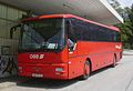
MAN ÜL 353 with word mark and Pflatsch in the traffic red paint of the ÖBB BahnBus , which was valid until 2005 , August 2004

ÖBB 1116 with word mark and Pflatsch in Saalfelden, August 2005
ÖBB 5047 at the terminus of the Stammersdorfer local railway in Obersdorf, August 2007

Double-decker control car with Pflatsch embossed into the sheet metal, Neunkirchen, 2014
A white slap on an old sleeping car at Zell am See train station , March 2019

.jpg)
.jpg)


.jpg)
,_2019.jpg)
Individual evidence
- ^ Richard Deiss: Silberling and iron: 1000 nicknames in transport and traffic and what's behind them. Book on Demand 2010, page 141. ISBN 978-3-83-916269-9 .
- ↑ Logo of the Austrian Federal Railways until 2004 - Pflatsch , ostarichi.org
- ↑ "Export, lettering, slop and spat" "Ask Andrea" column by Andrea Maria Dusl in Falter 29/2010 from 19 July 2010.
- ↑ ÖBB website in January 1999 ( Memento from January 25, 1999 in the Internet Archive )
- ↑ My railway year 2003 - a look back , in the video you can see, as in 2003, some Taurus locomotives (13:56) and a few Eurofima wagons (13:41) that had the wordmark without the paw, YouTube , accessed 24 May 2019
- ^ Kuk Eisenbahn picture album: The last 30 years 1978 - 2008. Volume 13 of Kuk Eisenbahn picture album: The railways in the Austro-Hungarian monarchy on old views: in memory of the railways of Austria and Hungary at the time of their commonality in a past important European empire . Bohmann 2009, page 138. ISBN 978-3-90-198393-1 .
- ↑ Alfred Horn: “The” new railway, construction (building construction, civil engineering, bridge construction, track construction), locomotives, advertising locomotives, timetable, signal and safety systems, Mariazellerbahn - once different, accidents, private railways, city traffic, volume 11. Bohmann 2007, page 118, 384. ISBN 978-3-90-198376-4 .