
Fraktur: Difference between revisions
Restored revision 1221869064 by HarukaAmaranth (talk) |
|||
| (185 intermediate revisions by more than 100 users not shown) | |||
| Line 1: | Line 1: | ||
{{short description|Typeface category}} |
|||
{{About|the script|the folk art|Fraktur (folk art)|other uses|Fracture (disambiguation)}} |
|||
{{About|the script|the folk art|Fraktur (folk art)|other uses}} |
|||
{{confused|Fracture}} |
|||
{{Special characters}} |
|||
{{use dmy dates|date=July 2023}} |
|||
{{Infobox writing system |
{{Infobox writing system |
||
|name = Latin script <br/>(Fraktur hand) |
|name = Latin script <br/>(Fraktur hand) |
||
|type = [[Alphabet]] |
|type = [[Alphabet]] |
||
|time = |
|time = 16th–20th centuries |
||
|languages = [[German language|German]] |
|languages = [[German language|German]]{{efn|And [[Germanic languages|related languages]].}} and some other [[Languages of Europe|European languages]] |
||
|fam1 = Blackletter |
|fam1 = Blackletter |
||
|sisters = ''See [[Blackletter]]'' |
|sisters = ''See [[Blackletter]]'' |
||
| Line 11: | Line 15: | ||
|imagesize = 200px |
|imagesize = 200px |
||
|iso15924 = Latf |
|iso15924 = Latf |
||
|unicode = <code>0020</code>–<code>00FF</code> |
|unicode = <code>0020</code>–<code>00FF</code>{{efn|normal Latin range; [[#Fraktur in Unicode|see below]]}} |
||
|footnotes = {{notelist}} |
|||
| |
|||
|direction = Left-to-right |
|||
|footnotes = 1: And [[Germanic languages|related languages]].<br/>2: normal Latin range; [[#Fraktur in Unicode|see below]] |
|||
}} |
|||
}}[[Image:Gebrochene Schriften.png|thumb|200px|A modern [[sans-serif]] and four blackletter typefaces (left to right): [[Blackletter|Textur(a)]], [[Rotunda (script)|Rotunda]], {{lang|de|[[Schwabacher]]}} and {{lang|de|Fraktur}}.]] |
|||
[[File:Gebrochene Schriften.png|thumb|A modern [[sans-serif]] and four blackletter typefaces (left to right): [[Blackletter|Textur(a)]], [[Rotunda (script)|Rotunda]], [[Schwabacher]] and Fraktur.]] |
|||
'''Fraktur''' ({{IPA-de| |
'''Fraktur''' ({{IPA-de|fʁakˈtuːɐ̯|lang|De-Fraktur.ogg}}) is a [[calligraphic hand]] of the [[Latin alphabet]] and any of several [[blackletter]] [[typeface]]s derived from this hand. It is designed such that the beginnings and ends of the individual strokes that make up each letter will be clearly visible, and often emphasized; in this way it is often contrasted with the curves of the [[Antiqua (typeface class)|Antiqua]] (common) typefaces where the letters are designed to flow and strokes connect together in a continuous fashion. The word "Fraktur" derives from Latin {{lang|la|frāctūra}} ("a break"), built from {{lang|la|frāctus}}, passive participle of {{lang|la|frangere}} ("to break"), which is also the root for the English word "fracture". In non-professional contexts, the term "Fraktur" is sometimes misused to refer to ''all'' blackletter typefaces{{snd}} while Fraktur typefaces do fall under that category, not all blackletter typefaces exhibit the Fraktur characteristics described above.{{efn|Similarly, the term "Gothic" is sometimes also incorrectly used to refer to Fraktur typefaces. However, in [[typography]], the term "Gothic" simply means [[sans-serif]].}} |
||
Fraktur was often characterized as "the German typeface", as it remained popular in Germany and much of Eastern Europe far longer than elsewhere. In Germany, utilizing more modern typefaces would prove controversial until 1941, when the [[Nazi Germany|Nazi]] government rendered any transition involuntary by banning the use of Fraktur typefaces. |
|||
Here is the [[English alphabet]] in Fraktur: |
|||
: <big>𝕬 𝕭 𝕮 𝕯 𝕰 𝕱 𝕲 𝕳 𝕴 𝕵 𝕶 𝕷 𝕸 𝕹 𝕺 𝕻 𝕼 𝕽 𝕾 𝕿 𝖀 𝖁 𝖂 𝖃 𝖄 𝖅</big> |
|||
: <big>𝖆 𝖇 𝖈 𝖉 𝖊 𝖋 𝖌 𝖍 𝖎 𝖏 𝖐 𝖑 𝖒 𝖓 𝖔 𝖕 𝖖 𝖗 𝖘 𝖙 𝖚 𝖛 𝖜 𝖝 𝖞 𝖟</big> |
|||
The word derives from the past participle ''{{lang|la|fractus}}'' ("broken") of Latin ''{{lang|la|frangere}}'' ("to break"); the same root as the English word "fracture". |
|||
==Characteristics== |
==Characteristics== |
||
Besides the 26 letters of the |
Besides the 26 letters of the [[ISO basic Latin alphabet]],{{efn|[[ISO basic Latin alphabet]] is derived from the [[English alphabet]] hence its 26 letters.}} Fraktur usually includes the Eszett {{angbr|[[ß]]}} in the {{angbr|ſʒ}} form, vowels with [[umlaut (diacritic)|umlauts]], and the [[long s]] {{angbr|ſ}}. Some Fraktur typefaces also include a variant form of the letter r known as the [[r rotunda]], and many include a variety of [[ligature (typography)|ligature]]s which are left over from cursive handwriting and have rules for their use. Most older Fraktur typefaces make no distinction between the [[majuscule]]s {{angbr|I}} and {{angbr|J}} (where the common shape is more suggestive of a {{angbr|J}}), even though the [[lower case|minuscules]] {{angbr|i}} and {{angbr|j}} are differentiated. |
||
One difference between the Fraktur and other blackletter scripts is that in the lower case |
One difference between the Fraktur and other blackletter scripts is that in the lower case {{angbr|o}}, the left part of the bow is broken, but the right part is not. In Danish texts composed in Fraktur, the letter {{angbr|[[ø]]}} was already preferred to the German and Swedish {{angbr|[[ö]]}} in the 16th century.{{efn|Compare, for example, |
||
{{lang|da|2=[http://commons.wikimedia.org/wiki/File:Bible_of_Christian_III_1550.jpg Bibla: Det er den gantske Hellige Scrifft: udsæt paa Danske]}}. 1550. {{in lang|da}} and {{lang|da|2=[https://books.google.com/books?id=zGRCAAAAcAAJ&pg=PT1089 Biblia: Det er Den gantske Hellige Scrifft paa Danske igien offuerseet oc prentet effter vor allernaadigste herris oc Kongis K. Christian den IV. Befaling]}}. 1633. {{in lang|da}}}} |
|||
In the Latvian variant of Fraktur, used mainly until the 1920s, there are additional characters used to denote Latvian letters with [[Diacritic|diacritical marks]].<ref name=Latvian /><ref>{{cite book|last=Švehs|first=Ernsts Aleksandrs|title=Jauna ābece|location=Rīga|publisher=W. F. Häcker|year=1877|url=http://gramatas.lndb.lv/periodika2-viewer/?lang=fr#issue:699218|page=7|access-date=2023-07-29|lang=lv}}</ref> Stroked letters {{angbr|Ꞡ ꞡ}}, {{angbr|Ꞣ ꞣ}}, {{angbr|Ł ł}}, {{angbr|Ꞥ ꞥ}}, {{angbr|Ꞧ ꞧ}} are used for palatalized consonants ({{angbr|Ģ ģ}}, {{angbr|Ķ ķ}}, {{angbr|Ļ ļ}}, {{angbr|Ņ ņ}}, {{angbr|Ŗ ŗ}}) stroked variants of {{angbr|s}} and {{angbr|ſ}} distinguish voiced and unvoiced sibilants or affricates ({{angbr|S ſ}} for voiced [z], {{angbr|Ꞩ ẜ}} for unvoiced [s], {{angbr|ſch}} [ž] / {{angbr|ẜch}} [š], {{angbr|dſch}} [dž] / {{angbr|tẜsch}} [č]), while accents ({{angbr|à}}, {{angbr|â}}, {{angbr|ê}}, {{angbr|î}}, {{angbr|ô}}, {{angbr|û}}) together with digraphs ({{angbr|ah}}, {{angbr|eh}} etc.) are used for long vowels ({{angbr|Ā ā}}, {{angbr|Ē ē}}, {{angbr|Ī ī}}, {{angbr|Ō ō}}, {{angbr|Ū ū}}). Stroked variants of {{angbr|s}} are also used in pre-1950 Sorbian orthography.<ref name=Latvian>{{cite web |url=https://unicode.org/L2/L2009/09112r-obliquestrokes.pdf |title=Proposal to encode 10 Latin letters for pre-1921 Latvian orthography |publisher=[[Unicode Consortium]] |date=2009-04-30 |url-status=live |archive-url=https://web.archive.org/web/20231127094550/https://unicode.org/L2/L2009/09112r-obliquestrokes.pdf |archive-date= Nov 27, 2023 }}</ref> |
|||
==Origin== |
==Origin== |
||
The first Fraktur typeface arose in the early 16th century, when Emperor [[Maximilian I, Holy Roman Emperor|Maximilian I]] commissioned the design of the ''[[Triumphal Arch (woodcut)|Triumphal Arch]]'' woodcut by |
The first Fraktur typeface arose in the early 16th century, when Emperor [[Maximilian I, Holy Roman Emperor|Maximilian I]] commissioned the design of the ''[[Triumphal Arch (woodcut)|Triumphal Arch]]'' woodcut by [[Albrecht Dürer]] and had a new typeface created specifically for this purpose, designed by [[Hieronymus Andreae]]. Fraktur types for [[printing]] were established by the [[Augsburg]] publisher {{ill|Johann Schönsperger|de}} at the issuance of a series of Maximilian's works such as his ''Prayer Book'' ({{lang|de-Latf|Gebetbuch}}, 1513) or the illustrated ''[[Theuerdank]]'' poem (1517).<ref>{{cite book |first=Fritz|last=Funke |title=Buchkunde: Ein Überblick über die Geschichte des Buches |trans-title=Book Customer: An overview of the history of the book |edition=6 |location=Munich |publisher=Saur |date=1999 |isbn=3-598-11390-0 |url={{GBurl|id=qeLoBQAAQBAJ|p=223}} |page= 223|lang=de}}</ref> |
||
Fraktur quickly overtook the earlier |
Fraktur quickly overtook the earlier [[Schwabacher]] and [[Textualis]] typefaces in popularity, and a wide variety of Fraktur fonts were carved and became common in the German-speaking world and areas under German influence (Scandinavia, Estonia, Latvia, [[Central Europe]]). In the 18th century, the German [[Theuerdank Fraktur]] was further developed by the [[Leipzig]] typographer [[Johann Gottlob Immanuel Breitkopf]] to create the typeset [[Breitkopf Fraktur]]. While over the succeeding centuries, most Central Europeans switched to [[Antiqua (typeface class)|Antiqua]], German speakers remained a notable holdout. |
||
==Use== |
== Use == |
||
{{ gallery|title=Page samples|width=190|height=190|align=center |
|||
[[File:Michna Ceska maryanska muzyka.jpg||250px|The collection „Česká mariánská muzyka“|right|thumb|x216px|A [[Czech language|Czech]] example of Fraktur: Title page of ''{{lang|cs|Česká mariánská muzika}}'' by {{lang|cs|[[Adam Václav Michna z Otradovic]]}} (1647) ("{{lang|cs|Cżeská maryánska muzyka}}" by [[Czech orthography|old orthography]])]] [[File:Gustav Vasa Bible 1541.jpg|thumb|175px|Front page of [[Gustav Vasa]]'s Bible from 1541, using [[Fraktur (script)|Fraktur]]. The title translated to English reads: "The Bible / That is / All the Holy Scriptures / in Swedish. Printed in {{lang|sv|[[Uppsala]]}}. 1541". (Note the use of [[long s]] and "th", akin to English; it would later change to "d".)]] |
|||
|File:Michna Ceska maryanska muzyka.jpg|A [[Czech language|Czech]] example of Fraktur: Title page of {{lang|cs|Česká mariánská muzika}} by [[Adam Václav Michna z Otradovic]] (1647) ("{{lang|cs-Latf|Cżeská maryánska muzyka}}" by [[Czech orthography|old orthography]]) |
|||
Typesetting in Fraktur was still very common in the early 20th century in all [[German language|German-speaking]] countries and areas, as well as in [[Norway]], [[Estonia]], and [[Latvia]], and was still used to a very small extent in [[Sweden]], [[Finland]] and [[Denmark]],<ref>In Denmark in 1902 the percentage of printed material using antiqua amounted to 95% according to R. Paulli, "{{lang|da|Den sejrende antikva}}", i: ''{{lang|da|Det trykte Ord}}'', published by Grafisk Cirkel, Copenhagen, 1940.</ref> while other countries typeset in [[Antiqua (typeface class)|Antiqua]] in the early 20th century. Some books at that time used related blackletter fonts such as ''{{lang|de|[[Schwabacher]]}}''; however, the predominant typeface was the ''{{lang|de|Normalfraktur}}'', which came in slight variations. |
|||
|File:Gustav Vasas bibel 1541 - title page.jpg|Front page of [[Gustav Vasa]]'s Bible from 1541, printed using [[Fraktur (script)|Fraktur]] |
|||
[[Image:Scripts in Europe (1901).jpg|thumb|left|Usage map: A map presenting the contemporary [[German language|German]] view of the extent of scripts around 1900. In reality only German-speaking countries, Estonia and Latvia still used Fraktur as the majority script at this time. Denmark had shifted to antiqua during the mid 19th century,<ref>R. Paulli, "{{lang|da|Den sejrende antikva}}", i: ''{{lang|da|Det trykte Ord}}'', published by Grafisk Cirkel, Copenhagen, 1940.</ref> and in Norway the majority of printed texts used antiqua around 1900.<ref>{{cite book |first=Tore |last=Rem |chapter=Materielle variasjoner. Overgang fra fraktur til antikva i Norge |editor-first=Mats |editor-last=Malm |editor2-first=Barbro Ståhle |editor2-last=Sjönell |editor3-first=Petra |editor3-last=Söderlund |title=Bokens materialitet: Bokhistoria och bibliografi |publisher=Svenska Vitterhetssamfundet |location=Stockholm |year=2009 |isbn=978-91-7230-149-8 }}</ref>]] |
|||
|File:Abecadło poskie XVI.png|Polish alphabet, 16th century |
|||
|File:Erstes Lesebuch alphabet.png|German alphabet from an 1850s American Mennonite children's book |
|||
|File:German newspaper from Missouri, Westliche Post, typeset with Fraktur, 1906-07-21, 1.png|Use in a German-speaking newspaper, the ''[[Westliche Post]]'', in [[Missouri]] in 1906.<ref name="Westli19060721p7">{{Cite news |
|||
| url = https://newspapers.com/article/westliche-post-die-letzte-salve/134458998/ |
|||
| date = 1906-07-21 |
|||
| page = 7 |
|||
| title = die letzte salve |
|||
| newspaper = Westliche Post |
|||
| location = St. Louis, Missouri |
|||
| via = Newspapers.com |
|||
| access-date = 2023-11-01 |
|||
}}</ref> |
|||
}} |
|||
[[File:Scripts in Europe (1901).jpg|thumb|Usage map: A map presenting the contemporary [[German language|German]] view of the extent of scripts around 1900. In reality only German-speakers, Estonia, and Latvia still used Fraktur as the majority script at this time. Denmark had shifted to Antiqua during the mid 19th century,<ref name=Paulli>{{cite book |first=Richard J.|last=Paulli |title=Den sejrende antikva|publisher=Grafisk Cirkel|location=Copenhagen |date= 1940 |type=special edition anniversary book "Det trykte ord" |lang=da}}</ref> and in Norway the majority of printed texts used Antiqua around 1900.<ref>{{cite book |first=Tore |last=Rem |chapter=Materielle variasjoner. Overgang fra fraktur til antikva i Norge |editor-first=Mats |editor-last=Malm |editor2-first=Barbro Ståhle |editor2-last=Sjönell |editor3-first=Petra |editor3-last=Söderlund |title=Bokens materialitet: Bokhistoria och bibliografi |publisher=Svenska Vitterhetssamfundet |location=Stockholm |year=2009 |isbn=978-91-7230-149-8 |lang=sv}}</ref> Notably, the map itself uses Antiqua for its legend, even though it is in German, indicating that Fraktur was no longer universally used even among German-speakers.]] |
|||
Typesetting in Fraktur was still very common in the early 20th century in all [[German language|German-speaking]] countries and areas, as well as in [[Norway]], [[Estonia]], and [[Latvia]], and was still used to a very small extent in [[Sweden]], [[Finland]] and [[Denmark]],{{efn|In Denmark in 1902 the percentage of printed material using antiqua amounted to 95% according to R. Paulli.<ref name=Paulli />}} even though other countries typeset in [[Antiqua (typeface class)|Antiqua]]. Some books at that time used related blackletter fonts such as [[Schwabacher]]; however, the predominant typeface was the Normalfraktur, which came in slight variations. |
|||
From the late 18th century to the late 19th century, Fraktur was progressively replaced by [[Antiqua (typeface class)|Antiqua]] as a symbol of the classicist age and emerging cosmopolitanism in most of the countries in Europe that had previously used Fraktur. This move was hotly debated in Germany, where it was known as the [[Antiqua–Fraktur dispute]]. The shift affected mostly scientific writing in Germany, whereas most [[belletristic]] literature and newspapers continued to be printed in broken fonts. |
|||
From the late 18th century to the late 19th century, Fraktur was progressively replaced by [[Antiqua (typeface class)|Antiqua]] as a symbol of the classicist age and emerging cosmopolitanism in most of the countries in Europe that had previously used Fraktur. This move was hotly debated in Germany, where it was known as the [[Antiqua–Fraktur dispute]]. The shift affected mostly scientific writing in Germany, whereas most [[belletristic]] literature and newspapers continued to be printed in Fraktur. |
|||
The Fraktur typefaces were in heavy use in [[Nazi Germany]], when they were initially represented as true German script; official Nazi documents and letterheads employed the font, and the cover of [[Adolf Hitler|Hitler]]'s ''{{lang|de|[[Mein Kampf]]}}'' used a hand-drawn version of it.<ref>{{cite web |url=http://historyweird.com/1941-nazis-ban-jewish-fonts/ |title= 1941: The Nazis ban Jewish fonts |work=historyweird.com |accessdate=2015-11-21 }}</ref> (However, ironically, the typefaces most popular in Nazi Germany, especially for running text as opposed to decorative uses such as in titles, were actually the more modernized fonts of the {{lang|de|[[:de:Gebrochene Grotesk|Gebrochene Grotesk]]}} type such as {{lang|de|[[:de:Tannenberg (Schriftart)|Tannenberg]]}}, designed in the early 20th century, mainly the 1930s, as [[Sans-serif#Grotesque|grotesque]] versions of blackletter typefaces.) The press was scolded for its frequent use of "Roman characters" under "Jewish influence" and German émigrés were urged to use only "German script".<ref>Eric Michaud, ''The Cult of Art in Nazi Germany'', tr. Janet Lloyd, Stanford, California: Stanford University Press, 2004, {{ISBN|9780804743266}}, pp. [https://books.google.com/books?id=QR_9T_8VLPAC&q=characters+known+as+German#v=snippet&q=characters%20known%20as%20German&f=false 215]–16 and [https://books.google.com/books?id=QR_9T_8VLPAC&q=characters+known+as+German#v=onepage&q=German%20writing%20is%20an%20expression%20of%20the%20German%20people&f=false Plate 110].</ref> This radically changed on January 3, 1941, when {{lang|de|[[Martin Bormann]]}} issued a circular to all public offices which declared Fraktur (and its corollary, the {{lang|de|[[Sütterlin]]}}-based handwriting) to be ''{{lang|de|Judenlettern}}'' (Jewish letters) and prohibited their further use.<ref>[http://www.ligaturix.de/bormann.htm Facsimile of Bormann's Memorandum (in German)]<br/>The memorandum itself is typed in Antiqua, but the [[NSDAP]] [[letterhead]] is printed in Fraktur.<br />"For general attention, on behalf of the {{lang|de|Führer}}, I make the following announcement:<br />It is wrong to regard or to describe the so-called Gothic script as a German script. In reality, the so-called Gothic script consists of {{lang|de|Schwabach}} Jew letters. Just as they later took control of the newspapers, upon the introduction of printing the Jews residing in Germany took control of the printing presses and thus in Germany the Schwabach Jew letters were forcefully introduced.<br/>Today the {{lang|de|Führer}}, talking with {{lang|de|Herr Reichsleiter Amann}} and {{lang|de|Herr}} Book Publisher {{lang|de|Adolf Müller}}, has decided that in the future the Antiqua script is to be described as normal script. All printed materials are to be gradually converted to this normal script. As soon as is feasible in terms of textbooks, only the normal script will be taught in village and state schools.<br />The use of the {{lang|de|Schwabach}} Jew letters by officials will in future cease; appointment certifications for functionaries, street signs, and so forth will in future be produced only in normal script.<br />On behalf of the {{lang|de|Führer}}, {{lang|de|Herr Reichsleiter Amann}} will in future convert those newspapers and periodicals that already have foreign distribution, or whose foreign distribution is desired, to normal script".</ref> German historian {{lang|de|Albert Kapr}} has speculated that the régime had realized that Fraktur would inhibit communication in the territories occupied during [[World War II]].<ref>{{cite book |first=Albert |last=Kapr |title=Fraktur: Form und Geschichte der gebrochenen Schriften |location=Mainz |publisher=H. Schmidt |year=1993 |page=81 |isbn=3-87439-260-0 }}</ref> |
|||
The Fraktur typefaces remained in use in [[Nazi Germany]], when they were initially represented as true German script; official Nazi documents and letterheads employed the font, and the cover of [[Adolf Hitler|Hitler]]'s {{lang|de|[[Mein Kampf]]}} used a hand-drawn version of it.<ref>{{cite web |url=http://historyweird.com/1941-nazis-ban-jewish-fonts/ |title= 1941: The Nazis ban Jewish fonts – using a Jewish font |work=historyweird.com |archive-url= https://web.archive.org/web/20151207071605/http://historyweird.com/1941-nazis-ban-jewish-fonts/ |access-date=2015-11-21 |archive-date= 2015-12-07}}</ref> However, more modernized fonts of the {{ill|Gebrochene Grotesk|de}} type such as [[Tannenberg (typeface)|Tannenberg]] were in fact the most popular typefaces in Nazi Germany, especially for running text as opposed to decorative uses such as in titles. These fonts were designed in the early 20th century, mainly the 1930s, as [[Sans-serif#Grotesque|grotesque]] versions of blackletter typefaces. The Nazis heavily used these fonts themselves, although the shift remained controversial; in fact, the press was at times scolded for its frequent use of "Roman characters" under "Jewish influence" and German émigrés were urged to use only "German script".<ref>{{cite book |last=Michaud |first=Eric |title=The Cult of Art in Nazi Germany |translator= Janet Lloyd |location= Stanford, California |publisher=Stanford University Press |date=2004 |isbn=0-8047-4326-6 |url={{GBurl|id=QR_9T_8VLPAC|q=characters+known+as+German}} |pages=215–216}}</ref><ref>[{{GBurl|id=QR_9T_8VLPAC&q=German+writing+is+an+expression+of+the+German+people}} Plate 110]</ref> On 3 January 1941, the Nazi Party ended this controversy by switching to international scripts such as Antiqua. [[Martin Bormann]] issued a circular (the "[[Schwabacher#History|normal type decree]]") to all public offices which declared Fraktur (and its corollary, the {{lang|de|[[Sütterlin]]}}-based handwriting) to be {{lang|de|Judenlettern}} (Jewish letters) and prohibited their further use.<ref>{{cite web |url=https://www.ligaturix.de/bormann.htm |title=Rundschreiben (Nicht zur Veröffentlichung) |lang=de |trans-title=Circular (Not for publication) |website=Ligaturix.de |first=Martin |last=Bormann |date=3 January 1941}}</ref> German historian Albert Kapr has speculated that the regime viewed Fraktur as inhibiting communication in the [[Areas annexed by Nazi Germany|occupied territories]] during [[World War II]].<ref>{{cite book |first=Albert |last=Kapr |title=Fraktur: Form und Geschichte der gebrochenen Schriften |location=Mainz |publisher=H. Schmidt |year=1993 |page=81 |isbn=3-87439-260-0 |lang=de}}</ref> |
|||
==Fraktur traditions after 1941== |
|||
===After 1941=== |
|||
Even with the abolition of Fraktur, some publications include elements of it in headlines. Very occasionally, academic works still used Fraktur in the text itself.{{citation needed|date=October 2013}} Notably, {{lang|de|Joachim Jeremias}}'s work "{{lang|de|Die Briefe an Timotheus und Titus}}" ("The Letters of Timothy and Titus") was published in 1963 using Fraktur. More often, some ligatures '''ch''', '''ck''' from Fraktur were used in antiqua-typed editions. That continued mostly up to the offset type period. Fraktur saw a brief resurgence after the war, but quickly disappeared in a Germany keen on modernising its appearance. |
|||
{{uncited section|date=April 2023}} |
|||
Even with the abolition of Fraktur, some publications included elements of it in headlines.{{citation needed|date=October 2013}} More often, some ligatures '''ch''', '''ck''' from Fraktur were used in Antiqua-typed editions up to the offset type period. Fraktur saw a brief resurgence after the war, but thereafter fell out of common use.{{cn|date=April 2023}} |
|||
Fraktur is today used mostly for decorative typesetting: for example, a number of traditional German newspapers such as the ''{{lang|de|[[Frankfurter Allgemeine]]}}'', as well as the Norwegian ''{{lang|no|[[Aftenposten]]}}'', still print their name in Fraktur on the [[nameplate (publishing)|masthead]] (as indeed do some newspapers in other European countries and the U.S.) and it is also popular for pub signs and the like. In this modern decorative use, the traditional rules about the use of [[long s]] and short s and of [[ligature (typography)|ligature]]s are often disregarded. |
|||
Fraktur is today used mostly for decorative typesetting: for example, a number of traditional German newspapers such as the {{lang|de-Latf|[[Frankfurter Allgemeine]]}}, as well as the Norwegian {{lang|no-Latf|[[Aftenpoſten]]}}, still print their name in Fraktur on the [[nameplate (publishing)|masthead]] (as indeed do some newspapers in other European countries and the U.S.) and it is also popular for pub signs and the like. In this modern decorative use, the traditional rules about the use of [[long s]] and short {{angbr|s}} and of [[ligature (typography)|ligature]]s are often disregarded. |
|||
Individual Fraktur letters are sometimes used in [[mathematics]], which often denotes associated or parallel concepts by the same letter in different fonts. For example, a [[Lie group]] is often denoted by ''G'', while its associated [[Lie algebra]] is <math>\mathfrak{g}</math>. A [[ring ideal]] might be denoted by <math>\mathfrak{a}</math> while an element is <math>a \in \mathfrak{a}</math>. The Fraktur <math>\mathfrak c</math> is also used to denote the [[cardinality of the continuum]], that is, the cardinality of the real line. In model theory, <math>\mathfrak{A}</math> is used to denote an arbitrary model, with ''A'' as its universe. Fraktur is also used to designate a [[Basis (linear algebra)|basis]] in [[linear algebra]], commonly with a <big>𝕭.</big> |
|||
Individual Fraktur letters are sometimes used in [[mathematics]], which often denotes associated or parallel concepts by the same letter in different fonts. For example, a [[Lie group]] is often denoted by ''G'', while its associated [[Lie algebra]] is <math>\mathfrak{g}</math>. A [[ring ideal]] might be denoted by <math>\mathfrak{a}</math> (or <math>\mathfrak{p}</math> if a prime ideal) while an element is <math>a \in \mathfrak{a}</math>. The Fraktur <math>\mathfrak c</math> is also sometimes used to denote the [[cardinality of the continuum]], that is, the cardinality of the real line. In [[model theory]], <math>\mathfrak{A}</math> is used to denote an arbitrary model, with ''A'' as its universe.{{cn|date=April 2023}} |
|||
Fraktur is still used among traditional [[Anabaptism|Anabaptists]] to print German texts, while [[Kurrent]] is used as hand writing for German texts. Groups that use both form of traditional German script are the [[Amish]], [[Old Order Mennonite]]s, [[Hutterite]]s and traditional [[Russian Mennonite|German-speaking Mennonites from Russia]] who live today mosty in [[Latin America]]. |
|||
Fraktur is still used among traditional [[Anabaptism|Anabaptists]] to print German texts, while [[Kurrent]] is used as hand writing for German texts. Groups that use both forms of traditional German script are the [[Amish]], [[Old Order Mennonite]]s, [[Hutterite]]s, and traditional [[Plautdietsch]]-speaking [[Russian Mennonites|Mennonites]] who live mostly in [[Latin America]] today.{{cn|date=April 2023}} |
|||
==Fraktur in Unicode== |
|||
In [[Unicode]], Fraktur is treated as a font of the Latin alphabet, and is not encoded separately. The additional ligatures that are required for Fraktur fonts will not be encoded in Unicode.<ref>{{cite web |url=http://www.unicode.org/faq/ligature_digraph.html#Pf7 |title=Ligatures, Digraphs, Presentation Forms vs. Plain Text |publisher=[[Unicode Consortium]] |date=7 July 2015 |accessdate=27 January 2017 }}</ref> Instead, Unicode proposes to deal with these ligatures using smart-font technologies such as [[OpenType]], [[Apple Advanced Typography|AAT]] or [[Graphite (SIL)|Graphite]]. There are many Fraktur fonts that do not use smart-font technologies, but use their own legacy encoding instead that is not compliant with Unicode. |
|||
==Typeface samples== |
|||
There are Fraktur symbols in the [[Unicode block]]s of [[mathematical alphanumeric symbols]], [[Letterlike symbols (Unicode block)|letterlike symbols]], and [[Latin Extended-E|Latin E]]. However, these are meant to be used only in mathematics.<ref name=":0">{{cite web |url=http://www.unicode.org/faq/ligature_digraph.html |title=Ligatures, Digraphs, Presentation Forms vs. Plain Text |publisher=[[Unicode Consortium]] |date=7 July 2015 }}</ref> Therefore, letters such as [[long s]], ''ä'', ''ö'', ''ü'', and ''ß'', which are not used in mathematics, are excluded. |
|||
[[File:Fraktur letter A.png|Aa]][[File:Fraktur letter B.png|Bb]][[File:Fraktur letter C.png|Cc]][[File:Fraktur letter D.png|Dd]][[File:Fraktur letter E.png|Ee]][[File:Fraktur letter F.png|Ff]][[File:Fraktur letter G.png|Gg]][[File:Fraktur letter H.png|Hh]][[File:Fraktur letter I.png|Ii]][[File:Fraktur letter J.png|Jj]][[File:Fraktur letter K.png|Kk]][[File:Fraktur letter L.png|Ll]][[File:Fraktur letter M.png|Mm]][[File:Fraktur letter N.png|Nn]][[File:Fraktur letter O.png|Oo]][[File:Fraktur letter P.png|Pp]][[File:Fraktur letter Q.png|Qq]][[File:Fraktur letter R.png|Rr]][[File:Fraktur letter S.png|Ss]][[File:Fraktur letter T.png|Tt]][[File:Fraktur letter U.png|Uu]][[File:Fraktur letter V.png|Vv]][[File:Fraktur letter W.png|Ww]][[File:Fraktur letter X.png|Xx]][[File:Fraktur letter Y.png|Yy]][[File:Fraktur letter Z.png|Zz]][[File:Fraktur letter A-umlaut.png|Ää]][[File:Fraktur letter O-umlaut.png|Öö]][[File:Fraktur letter U-umlaut.png|Üü]][[File:Fraktur letter Eszett.png|ß]][[File:Fraktur ligature CH.png|ch]][[File:Fraktur ligature CK.png|ck]][[File:Fraktur ligature TZ.png|tz]] |
|||
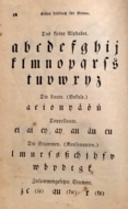
In the figures below, the German sentence that appears after the names of the fonts (Walbaum-Fraktur in Fig. 1 and Humboldtfraktur in Fig. 2 reads, {{lang|de-Latf|Victor jagt zwölf Boxkämpfer quer über den Sylter Deich}}. It means "Victor chases twelve boxers across the [[Sylt]] dike" and contains all 26 letters of the alphabet plus the [[umlaut (diacritic)|umlauted glyphs]] used in German, making it an example of a [[pangram]]. |
|||
: <big>𝔄𝔅ℭ𝔇𝔈𝔉𝔊ℌℑ𝔍𝔎𝔏𝔐𝔑𝔒𝔓𝔔ℜ𝔖𝔗𝔘𝔙𝔚𝔛𝔜ℨ</big> |
|||
[[File:Fraktur walbaum.png|center|frame|Fig. 1. Walbaum-Fraktur (1800)]] |
|||
: <big>𝔞𝔟𝔠𝔡𝔢𝔣𝔤𝔥𝔦𝔧𝔨𝔩𝔪𝔫𝔬𝔭𝔮𝔯𝔰𝔱𝔲𝔳𝔴𝔵𝔶𝔷 ꬲꬽ</big> |
|||
[[File:Fraktur humboldtfraktur.png|center|frame|Fig. 2. Humboldtfraktur (Hiero Rhode, 1938)]] |
|||
=={{anchor|Fraktur in Unicode}}Unicode== |
|||
==Typeface samples== |
|||
[[Unicode]] does not encode Fraktur as a separate script. Instead, Fraktur is considered a "presentation form" of the Latin alphabet.<ref>{{cite web |url=https://www.unicode.org/faq/ligature_digraph.html#Pf1 |title=Ligatures, Digraphs, Presentation Forms vs. Plain Text {{!}} Presentation forms |publisher=[[Unicode Consortium]] |date=7 July 2015 |access-date=19 September 2022 }}</ref>{{efn|For examples of more obvious "presentation forms", see [[display typeface]].}} Thus, the additional ligatures that are required for Fraktur typefaces will not be encoded in Unicode: support for these ligatures is a font engineering issue left up to font developers.<ref>{{cite web |url=https://www.unicode.org/faq/ligature_digraph.html#Lig2 |title=Ligatures, Digraphs, Presentation Forms vs. Plain Text {{!}} Ligatures |publisher=[[Unicode Consortium]] |date=7 July 2015 |access-date=19 September 2022 }}</ref> |
|||
[[File:Fraktur letter A.png]][[File:Fraktur letter B.png]][[File:Fraktur letter C.png]][[File:Fraktur letter D.png]][[File:Fraktur letter E.png]][[File:Fraktur letter F.png]][[File:Fraktur letter G.png]][[File:Fraktur letter H.png]][[File:Fraktur letter I.png]][[File:Fraktur letter J.png]][[File:Fraktur letter K.png]][[File:Fraktur letter L.png]][[File:Fraktur letter M.png]][[File:Fraktur letter N.png]][[File:Fraktur letter O.png]][[File:Fraktur letter P.png]][[File:Fraktur letter Q.png]][[File:Fraktur letter R.png]][[File:Fraktur letter S.png]][[File:Fraktur letter T.png]][[File:Fraktur letter U.png]][[File:Fraktur letter V.png]][[File:Fraktur letter W.png]][[File:Fraktur letter X.png]][[File:Fraktur letter Y.png]][[File:Fraktur letter Z.png]][[File:Fraktur letter A-umlaut.png]][[File:Fraktur letter O-umlaut.png]][[File:Fraktur letter U-umlaut.png]][[File:Fraktur ligature CH.png]][[File:Fraktur ligature TZ.png]] |
|||
There are, however, two sets of Fraktur symbols in the [[Unicode block]]s of [[Mathematical Alphanumeric Symbols]], [[Letterlike symbols (Unicode block)|Letterlike Symbols]], and [[Latin Extended-E]]. The [[long s]], [[ß]], and the [[Umlaut (diacritic)|umlauted vowels]] are not encoded, as the characters are meant to be used in mathematics and phonetics, so they are not suitable for typesetting German-language texts.<ref>{{cite web |url=https://www.unicode.org/faq/ligature_digraph.html#Pf5|title=Ligatures, Digraphs, Presentation Forms vs. Plain Text {{!}} Why does Unicode contain whole alphabets of "italic" or "bold" characters in Plane 1? |publisher=[[Unicode Consortium]] |date=7 July 2015 |access-date=19 September 2022 }}</ref> |
|||
In the figures below, the German sentence that appears after the names of the fonts ({{lang|de|Walbaum-Fraktur}} in Fig. 1 and {{lang|de|Humboldtfraktur}} in Fig. 2) reads, ''"{{lang|de|Victor jagt zwölf Boxkämpfer quer über den Sylter Deich}}"''. It means "Victor chases twelve boxers across the [[Sylt]] dike" and contains all 26 letters of the alphabet plus the [[umlaut (diacritic)|umlauted glyphs]] used in German, making it an example of a [[pangram]]. |
|||
[[Image:Fraktur walbaum.png|center|frame|Fig. 1. {{lang|de|Walbaum-Fraktur}} (1800)]] |
|||
[[Image:Fraktur humboldtfraktur.png|center|frame|Fig. 2. {{lang|de|Humboldtfraktur}} (Hiero Rhode, 1938)]] |
|||
: <big>𝔄 𝔅 ℭ 𝔇 𝔈 𝔉 𝔊 ℌ ℑ 𝔍 𝔎 𝔏 𝔐 𝔑 𝔒 𝔓 𝔔 ℜ 𝔖 𝔗 𝔘 𝔙 𝔚 𝔛 𝔜 ℨ</big> |
|||
==See also== |
|||
: <big>𝔞 𝔟 𝔠 𝔡 𝔢 𝔣 𝔤 𝔥 𝔦 𝔧 𝔨 𝔩 𝔪 𝔫 𝔬 𝔭 𝔮 𝔯 𝔰 𝔱 𝔲 𝔳 𝔴 𝔵 𝔶 𝔷</big> |
|||
{| width=575px |
|||
: <big>𝕬 𝕭 𝕮 𝕯 𝕰 𝕱 𝕲 𝕳 𝕴 𝕵 𝕶 𝕷 𝕸 𝕹 𝕺 𝕻 𝕼 𝕽 𝕾 𝕿 𝖀 𝖁 𝖂 𝖃 𝖄 𝖅</big> |
|||
| valign=top | |
|||
: <big>𝖆 𝖇 𝖈 𝖉 𝖊 𝖋 𝖌 𝖍 𝖎 𝖏 𝖐 𝖑 𝖒 𝖓 𝖔 𝖕 𝖖 𝖗 𝖘 𝖙 𝖚 𝖛 𝖜 𝖝 𝖞 𝖟</big> |
|||
* [[Blackletter]] |
|||
* {{lang|de|[[Breitkopf Fraktur]]}} |
|||
== See also == |
|||
* [[Emphasis (typography)]] |
|||
* {{Annotated link|Antiqua–Fraktur dispute}} |
|||
* {{lang|de|[[Eszett]]}} (letter ''ß'') |
|||
* {{Annotated link|Blackletter}} |
|||
* {{lang|de|[[Fette Fraktur]]}} |
|||
* {{Annotated link|Breitkopf Fraktur}} |
|||
* [[Fraktur (folk art)]] |
|||
* {{Annotated link|Fette Fraktur}} |
|||
* [[Gaelic type|Gaelic script]] |
|||
* {{Annotated link|Fraktur (folk art)}} |
|||
| |<!--spacer--> |
|||
* {{Annotated link|Kurrent}} |
|||
| valign=top | |
|||
* {{Annotated link|Mathematical Alphanumeric Symbols}} |
|||
* {{lang|de|[[Kurrent]]}} handwriting |
|||
* {{Annotated link|Sütterlin}} |
|||
* [[Long s]] |
|||
* [[Mathematical Alphanumeric Symbols]] |
|||
==Notes== |
|||
* {{lang|no|[[Morgenbladet]]}} |
|||
{{notelist}} |
|||
* [[Pennsylvania Dutch]] |
|||
* {{lang|de|[[Sütterlin]]}} handwriting |
|||
* [[Uncial script]] |
|||
|} |
|||
==References== |
==References== |
||
| Line 95: | Line 108: | ||
==Further reading== |
==Further reading== |
||
* Bain |
* {{cite book|last1=Bain|first1=Peter|first2=Paul|last2=Shaw|title=Blackletter: Type and National Identity|publisher=Princeton Architectural Press|year=1998|isbn=1-56898-125-2}} |
||
* {{cite book|last1=Fiedl|first1=Frederich|first2=Nicholas|last2=Ott|first3=Bernard|last3=Stein|title=Typography: An Encyclopedic Survey of Type Design and Techniques Through History|location=New York|publisher=Black Dog & Leventhal|year=1998|isbn=1-57912-023-7}} |
|||
* {{lang|de|Silvia Hartmann: ''Fraktur oder Antiqua. Der Schriftstreit von 1881 bis 1941'', Peter Lang, Frankfurt am Main u. a. 1998 (2. üb. A. 1999)}}, {{ISBN|978-3-631-35090-4}} |
|||
* {{cite book|first=Silvia|last=Hartmann|title=Fraktur oder Antiqua. Der Schriftstreit von 1881 bis 1941|language=de|publisher=Peter Lang|location=Frankfurt am Main|year=1998|isbn=3-631-35090-2}} |
|||
* Fiedl, Frederich, Nicholas Ott and Bernard Stein. ''Typography: An Encyclopedic Survey of Type Design and Techniques Through History.'' Black Dog & Leventhal: 1998. {{ISBN|1-57912-023-7}}. |
|||
* |
* {{cite book|last=Macmillan|first=Neil|title=An A–Z of Type Designers|publisher=[[Yale University Press]]|year=2006|isbn=0-300-11151-7}} |
||
==External links== |
==External links== |
||
{{sisterlinks|d=Q148443|n=no|b=no|v=no|voy=no|q=no|m=no|mw=no|s=no|species=no}} |
{{sisterlinks|d=Q148443|n=no|b=no|v=no|voy=no|q=no|m=no|mw=no|s=no|species=no}} |
||
* [ |
* [https://web.library.yale.edu/cataloging/music/fraktur A complete Fraktur chart] (Library of Yale University) |
||
* [http://unifraktur.sourceforge.net/ UniFraktur]: Free Fraktur fonts and resources at [[SourceForge]] |
|||
* {{de icon}} [http://www.steffmann.de/ Website of Dieter Steffmann], which has a large number of [https://web.archive.org/web/20160203234441/http://moorstation.org/typoasis/designers/steffmann/index.htm digitized Fraktur fonts] |
|||
* [https://www.familyhistoryfanatics.com/translating-fraktur-newspaper Translating newspapers set in Fraktur] (familyhistoryfanatics) |
|||
* {{de icon}} [http://www.fraktur.biz/ Fraktur fonts for the computer] |
|||
* {{de icon}} [http://www.fraktur.com/ Fraktur fonts — German Fonts for the PC] |
|||
* [https://web.archive.org/web/20151016231306/http://www.cooper.edu/art/lubalin/bletterpub.html Blackletter: Type and National Identity] |
|||
* {{De icon}} [http://www.fraktur.com Delbanco: German Purveyors of Fraktur fonts] (commercial) |
|||
* [http://www.i18nguy.com/surrogates.html Setting up Microsoft Windows NT, 2000 or Windows XP to support Unicode supplementary characters] |
|||
* [http://unifraktur.sourceforge.net/ UniFraktur]: Free [[Unicode]]-compliant Fraktur fonts and resources |
|||
{{Typography terms}} |
{{Typography terms}} |
||
{{List of writing systems}} |
{{List of writing systems}} |
||
{{Authority control}} |
|||
[[Category:Blackletter]] |
[[Category:Blackletter]] |
||
[[Category:Blackletter typefaces]] |
[[Category:Blackletter typefaces]] |
||
[[Category:Latin script]] |
[[Category:Latin script]] |
||
[[Category:German orthography]] |
[[Category:German orthography]] |
||
[[Category:16th-century introductions]] |
|||
[[Category:1941 disestablishments in Germany]] |
|||
Latest revision as of 02:47, 8 May 2024
| Latin script (Fraktur hand) | |
|---|---|
 | |
| Script type | |
Time period | 16th–20th centuries |
| Direction | Left-to-right |
| Languages | German[a] and some other European languages |
| Related scripts | |
Parent systems | Blackletter
|
Child systems | Kurrentschrift, including Sütterlin |
Sister systems | See Blackletter |
| ISO 15924 | |
| ISO 15924 | Latf (217), Latin (Fraktur variant) |
| Unicode | |
0020–00FF[b] | |
| |

Fraktur (German: [fʁakˈtuːɐ̯] ) is a calligraphic hand of the Latin alphabet and any of several blackletter typefaces derived from this hand. It is designed such that the beginnings and ends of the individual strokes that make up each letter will be clearly visible, and often emphasized; in this way it is often contrasted with the curves of the Antiqua (common) typefaces where the letters are designed to flow and strokes connect together in a continuous fashion. The word "Fraktur" derives from Latin frāctūra ("a break"), built from frāctus, passive participle of frangere ("to break"), which is also the root for the English word "fracture". In non-professional contexts, the term "Fraktur" is sometimes misused to refer to all blackletter typefaces – while Fraktur typefaces do fall under that category, not all blackletter typefaces exhibit the Fraktur characteristics described above.[a]
Fraktur was often characterized as "the German typeface", as it remained popular in Germany and much of Eastern Europe far longer than elsewhere. In Germany, utilizing more modern typefaces would prove controversial until 1941, when the Nazi government rendered any transition involuntary by banning the use of Fraktur typefaces.
Characteristics[edit]
Besides the 26 letters of the ISO basic Latin alphabet,[b] Fraktur usually includes the Eszett ⟨ß⟩ in the ⟨ſʒ⟩ form, vowels with umlauts, and the long s ⟨ſ⟩. Some Fraktur typefaces also include a variant form of the letter r known as the r rotunda, and many include a variety of ligatures which are left over from cursive handwriting and have rules for their use. Most older Fraktur typefaces make no distinction between the majuscules ⟨I⟩ and ⟨J⟩ (where the common shape is more suggestive of a ⟨J⟩), even though the minuscules ⟨i⟩ and ⟨j⟩ are differentiated.
One difference between the Fraktur and other blackletter scripts is that in the lower case ⟨o⟩, the left part of the bow is broken, but the right part is not. In Danish texts composed in Fraktur, the letter ⟨ø⟩ was already preferred to the German and Swedish ⟨ö⟩ in the 16th century.[c]
In the Latvian variant of Fraktur, used mainly until the 1920s, there are additional characters used to denote Latvian letters with diacritical marks.[1][2] Stroked letters ⟨Ꞡ ꞡ⟩, ⟨Ꞣ ꞣ⟩, ⟨Ł ł⟩, ⟨Ꞥ ꞥ⟩, ⟨Ꞧ ꞧ⟩ are used for palatalized consonants (⟨Ģ ģ⟩, ⟨Ķ ķ⟩, ⟨Ļ ļ⟩, ⟨Ņ ņ⟩, ⟨Ŗ ŗ⟩) stroked variants of ⟨s⟩ and ⟨ſ⟩ distinguish voiced and unvoiced sibilants or affricates (⟨S ſ⟩ for voiced [z], ⟨Ꞩ ẜ⟩ for unvoiced [s], ⟨ſch⟩ [ž] / ⟨ẜch⟩ [š], ⟨dſch⟩ [dž] / ⟨tẜsch⟩ [č]), while accents (⟨à⟩, ⟨â⟩, ⟨ê⟩, ⟨î⟩, ⟨ô⟩, ⟨û⟩) together with digraphs (⟨ah⟩, ⟨eh⟩ etc.) are used for long vowels (⟨Ā ā⟩, ⟨Ē ē⟩, ⟨Ī ī⟩, ⟨Ō ō⟩, ⟨Ū ū⟩). Stroked variants of ⟨s⟩ are also used in pre-1950 Sorbian orthography.[1]
Origin[edit]
The first Fraktur typeface arose in the early 16th century, when Emperor Maximilian I commissioned the design of the Triumphal Arch woodcut by Albrecht Dürer and had a new typeface created specifically for this purpose, designed by Hieronymus Andreae. Fraktur types for printing were established by the Augsburg publisher Johann Schönsperger at the issuance of a series of Maximilian's works such as his Prayer Book (Gebetbuch, 1513) or the illustrated Theuerdank poem (1517).[3]
Fraktur quickly overtook the earlier Schwabacher and Textualis typefaces in popularity, and a wide variety of Fraktur fonts were carved and became common in the German-speaking world and areas under German influence (Scandinavia, Estonia, Latvia, Central Europe). In the 18th century, the German Theuerdank Fraktur was further developed by the Leipzig typographer Johann Gottlob Immanuel Breitkopf to create the typeset Breitkopf Fraktur. While over the succeeding centuries, most Central Europeans switched to Antiqua, German speakers remained a notable holdout.
Use[edit]
-
 A Czech example of Fraktur: Title page of Česká mariánská muzika by Adam Václav Michna z Otradovic (1647) ("Cżeská maryánska muzyka" by old orthography)
 -
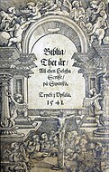 Front page of Gustav Vasa's Bible from 1541, printed using Fraktur
 -
 Polish alphabet, 16th century
 -
 German alphabet from an 1850s American Mennonite children's book
 -
![Use in a German-speaking newspaper, the Westliche Post, in Missouri in 1906.[4]](//upload.wikimedia.org/wikipedia/commons/thumb/5/57/German_newspaper_from_Missouri%2C_Westliche_Post%2C_typeset_with_Fraktur%2C_1906-07-21%2C_1.png/190px-German_newspaper_from_Missouri%2C_Westliche_Post%2C_typeset_with_Fraktur%2C_1906-07-21%2C_1.png)


![Use in a German-speaking newspaper, the Westliche Post, in Missouri in 1906.[4]](/wiki/File:German_newspaper_from_Missouri,_Westliche_Post,_typeset_with_Fraktur,_1906-07-21,_1.png)
.jpg)
Typesetting in Fraktur was still very common in the early 20th century in all German-speaking countries and areas, as well as in Norway, Estonia, and Latvia, and was still used to a very small extent in Sweden, Finland and Denmark,[d] even though other countries typeset in Antiqua. Some books at that time used related blackletter fonts such as Schwabacher; however, the predominant typeface was the Normalfraktur, which came in slight variations.
From the late 18th century to the late 19th century, Fraktur was progressively replaced by Antiqua as a symbol of the classicist age and emerging cosmopolitanism in most of the countries in Europe that had previously used Fraktur. This move was hotly debated in Germany, where it was known as the Antiqua–Fraktur dispute. The shift affected mostly scientific writing in Germany, whereas most belletristic literature and newspapers continued to be printed in Fraktur.
The Fraktur typefaces remained in use in Nazi Germany, when they were initially represented as true German script; official Nazi documents and letterheads employed the font, and the cover of Hitler's Mein Kampf used a hand-drawn version of it.[7] However, more modernized fonts of the Gebrochene Grotesk type such as Tannenberg were in fact the most popular typefaces in Nazi Germany, especially for running text as opposed to decorative uses such as in titles. These fonts were designed in the early 20th century, mainly the 1930s, as grotesque versions of blackletter typefaces. The Nazis heavily used these fonts themselves, although the shift remained controversial; in fact, the press was at times scolded for its frequent use of "Roman characters" under "Jewish influence" and German émigrés were urged to use only "German script".[8][9] On 3 January 1941, the Nazi Party ended this controversy by switching to international scripts such as Antiqua. Martin Bormann issued a circular (the "normal type decree") to all public offices which declared Fraktur (and its corollary, the Sütterlin-based handwriting) to be Judenlettern (Jewish letters) and prohibited their further use.[10] German historian Albert Kapr has speculated that the regime viewed Fraktur as inhibiting communication in the occupied territories during World War II.[11]
After 1941[edit]
Even with the abolition of Fraktur, some publications included elements of it in headlines.[citation needed] More often, some ligatures ch, ck from Fraktur were used in Antiqua-typed editions up to the offset type period. Fraktur saw a brief resurgence after the war, but thereafter fell out of common use.[citation needed]
Fraktur is today used mostly for decorative typesetting: for example, a number of traditional German newspapers such as the Frankfurter Allgemeine, as well as the Norwegian Aftenpoſten, still print their name in Fraktur on the masthead (as indeed do some newspapers in other European countries and the U.S.) and it is also popular for pub signs and the like. In this modern decorative use, the traditional rules about the use of long s and short ⟨s⟩ and of ligatures are often disregarded.
Individual Fraktur letters are sometimes used in mathematics, which often denotes associated or parallel concepts by the same letter in different fonts. For example, a Lie group is often denoted by G, while its associated Lie algebra is . A ring ideal might be denoted by (or if a prime ideal) while an element is . The Fraktur is also sometimes used to denote the cardinality of the continuum, that is, the cardinality of the real line. In model theory, is used to denote an arbitrary model, with A as its universe.[citation needed]


Fraktur is still used among traditional Anabaptists to print German texts, while Kurrent is used as hand writing for German texts. Groups that use both forms of traditional German script are the Amish, Old Order Mennonites, Hutterites, and traditional Plautdietsch-speaking Mennonites who live mostly in Latin America today.[citation needed]
Typeface samples[edit]


In the figures below, the German sentence that appears after the names of the fonts (Walbaum-Fraktur in Fig. 1 and Humboldtfraktur in Fig. 2 reads, Victor jagt zwölf Boxkämpfer quer über den Sylter Deich. It means "Victor chases twelve boxers across the Sylt dike" and contains all 26 letters of the alphabet plus the umlauted glyphs used in German, making it an example of a pangram.


Unicode[edit]
Unicode does not encode Fraktur as a separate script. Instead, Fraktur is considered a "presentation form" of the Latin alphabet.[12][e] Thus, the additional ligatures that are required for Fraktur typefaces will not be encoded in Unicode: support for these ligatures is a font engineering issue left up to font developers.[13]
There are, however, two sets of Fraktur symbols in the Unicode blocks of Mathematical Alphanumeric Symbols, Letterlike Symbols, and Latin Extended-E. The long s, ß, and the umlauted vowels are not encoded, as the characters are meant to be used in mathematics and phonetics, so they are not suitable for typesetting German-language texts.[14]
- 𝔄 𝔅 ℭ 𝔇 𝔈 𝔉 𝔊 ℌ ℑ 𝔍 𝔎 𝔏 𝔐 𝔑 𝔒 𝔓 𝔔 ℜ 𝔖 𝔗 𝔘 𝔙 𝔚 𝔛 𝔜 ℨ
- 𝔞 𝔟 𝔠 𝔡 𝔢 𝔣 𝔤 𝔥 𝔦 𝔧 𝔨 𝔩 𝔪 𝔫 𝔬 𝔭 𝔮 𝔯 𝔰 𝔱 𝔲 𝔳 𝔴 𝔵 𝔶 𝔷
- 𝕬 𝕭 𝕮 𝕯 𝕰 𝕱 𝕲 𝕳 𝕴 𝕵 𝕶 𝕷 𝕸 𝕹 𝕺 𝕻 𝕼 𝕽 𝕾 𝕿 𝖀 𝖁 𝖂 𝖃 𝖄 𝖅
- 𝖆 𝖇 𝖈 𝖉 𝖊 𝖋 𝖌 𝖍 𝖎 𝖏 𝖐 𝖑 𝖒 𝖓 𝖔 𝖕 𝖖 𝖗 𝖘 𝖙 𝖚 𝖛 𝖜 𝖝 𝖞 𝖟
See also[edit]
- Antiqua–Fraktur dispute – Typographical dispute in the 19th- and early 20th-century in Germany
- Blackletter – Historic European script and typeface
- Breitkopf Fraktur – Blackletter typeface designed 1750
- Fette Fraktur – Typeface designed by Bauer in 1850
- Fraktur (folk art) – Illuminated folk art from Pennsylvania
- Kurrent – Form of German-language handwriting
- Mathematical Alphanumeric Symbols – Unicode block
- Sütterlin – Historical form of German handwriting, used 1915–1970s
Notes[edit]
- ^ Similarly, the term "Gothic" is sometimes also incorrectly used to refer to Fraktur typefaces. However, in typography, the term "Gothic" simply means sans-serif.
- ^ ISO basic Latin alphabet is derived from the English alphabet hence its 26 letters.
- ^ Compare, for example, Bibla: Det er den gantske Hellige Scrifft: udsæt paa Danske. 1550. (in Danish) and Biblia: Det er Den gantske Hellige Scrifft paa Danske igien offuerseet oc prentet effter vor allernaadigste herris oc Kongis K. Christian den IV. Befaling. 1633. (in Danish)
- ^ In Denmark in 1902 the percentage of printed material using antiqua amounted to 95% according to R. Paulli.[5]
- ^ For examples of more obvious "presentation forms", see display typeface.
References[edit]
- ^ a b "Proposal to encode 10 Latin letters for pre-1921 Latvian orthography" (PDF). Unicode Consortium. 30 April 2009. Archived (PDF) from the original on 27 November 2023.
- ^ Švehs, Ernsts Aleksandrs (1877). Jauna ābece (in Latvian). Rīga: W. F. Häcker. p. 7. Retrieved 29 July 2023.
- ^ Funke, Fritz (1999). Buchkunde: Ein Überblick über die Geschichte des Buches [Book Customer: An overview of the history of the book] (in German) (6 ed.). Munich: Saur. p. 223. ISBN 3-598-11390-0.
- ^ "die letzte salve". Westliche Post. St. Louis, Missouri. 21 July 1906. p. 7. Retrieved 1 November 2023 – via Newspapers.com.
- ^ a b Paulli, Richard J. (1940). Den sejrende antikva (special edition anniversary book "Det trykte ord") (in Danish). Copenhagen: Grafisk Cirkel.
- ^ Rem, Tore (2009). "Materielle variasjoner. Overgang fra fraktur til antikva i Norge". In Malm, Mats; Sjönell, Barbro Ståhle; Söderlund, Petra (eds.). Bokens materialitet: Bokhistoria och bibliografi (in Swedish). Stockholm: Svenska Vitterhetssamfundet. ISBN 978-91-7230-149-8.
- ^ "1941: The Nazis ban Jewish fonts – using a Jewish font". historyweird.com. Archived from the original on 7 December 2015. Retrieved 21 November 2015.
- ^ Michaud, Eric (2004). The Cult of Art in Nazi Germany. Translated by Janet Lloyd. Stanford, California: Stanford University Press. pp. 215–216. ISBN 0-8047-4326-6.
- ^ Plate 110
- ^ Bormann, Martin (3 January 1941). "Rundschreiben (Nicht zur Veröffentlichung)" [Circular (Not for publication)]. Ligaturix.de (in German).
- ^ Kapr, Albert (1993). Fraktur: Form und Geschichte der gebrochenen Schriften (in German). Mainz: H. Schmidt. p. 81. ISBN 3-87439-260-0.
- ^ "Ligatures, Digraphs, Presentation Forms vs. Plain Text | Presentation forms". Unicode Consortium. 7 July 2015. Retrieved 19 September 2022.
- ^ "Ligatures, Digraphs, Presentation Forms vs. Plain Text | Ligatures". Unicode Consortium. 7 July 2015. Retrieved 19 September 2022.
- ^ "Ligatures, Digraphs, Presentation Forms vs. Plain Text | Why does Unicode contain whole alphabets of "italic" or "bold" characters in Plane 1?". Unicode Consortium. 7 July 2015. Retrieved 19 September 2022.
Further reading[edit]
- Bain, Peter; Shaw, Paul (1998). Blackletter: Type and National Identity. Princeton Architectural Press. ISBN 1-56898-125-2.
- Fiedl, Frederich; Ott, Nicholas; Stein, Bernard (1998). Typography: An Encyclopedic Survey of Type Design and Techniques Through History. New York: Black Dog & Leventhal. ISBN 1-57912-023-7.
- Hartmann, Silvia (1998). Fraktur oder Antiqua. Der Schriftstreit von 1881 bis 1941 (in German). Frankfurt am Main: Peter Lang. ISBN 3-631-35090-2.
- Macmillan, Neil (2006). An A–Z of Type Designers. Yale University Press. ISBN 0-300-11151-7.
External links[edit]
 Definitions from Wiktionary
 Media from Commons
 Data from Wikidata
- A complete Fraktur chart (Library of Yale University)
- UniFraktur: Free Fraktur fonts and resources at SourceForge
- Translating newspapers set in Fraktur (familyhistoryfanatics)
| Page | |||||||||||
|---|---|---|---|---|---|---|---|---|---|---|---|
| Paragraph | |||||||||||
| Character |
| ||||||||||
| Typeface classifications |
| ||||||||||
| Punctuation | |||||||||||
| Typesetting | |||||||||||
| Typographic units | |||||||||||
| Digital typography | |||||||||||
| Typography in other writing systems | |||||||||||
| Related articles | |||||||||||
| Related tables | |||||||||||