
German Kurrentschrift


The German cursive ( Latin currere "run"), even and especially abroad only as Kurrent called, is a cursive . It was the general traffic script in the entire German-speaking area from around the beginning of modern times until the middle of the 20th century (in Switzerland until the beginning of the 20th century) . It will also German cursive or German script called. The term " German magazine but" can also refer to certain broken typefaces refer.
Typographically , the German Kurrent script is one of the broken scripts. It differs from the round, “ Latin ” script in its acute angles (“Spitzschrift”) - although the Kurrent also has many curves. With minor modifications it was also used in Scandinavia - in Denmark and Norway as "Gotisk skrift" - used until 1875.
The German Kurrent script was typically originally written with a quill pen , later also with a ribbon spring , which led to direction-dependent changes in the line thickness . Since the 19th century it was also written with a pointed pen , which produced lines that swell up and down.
A variant of the German Kurrent script that was introduced in Germany in the 20th century as the starting font for school lessons is the Sütterlin script , which was developed for writing with a constant-tension pen with a uniform line width.
Since the middle of the 20th century, especially after it was abolished in schools in 1941 by the National Socialists' standard script decree, the German Kurrent script (including its Sütterlin script) was used less and less. Historians and scientists from other disciplines as well as those interested in genealogy need to know them in order to be able to read documents written in German Kurrentschrift.
history
Development (16th - 19th century)
The German Kurrentschrift developed from the Bastarda in the early 16th century .
The Nuremberg and Saxon writing schools were influential in their development in the 17th and 18th centuries . In Prussia , a standard font was first introduced in schools in 1714 by a decree, which is said to go back to the Berlin teacher Hilmar Curas ( Joachimsthalsches Gymnasium ). Their pointed forms, inclined to the right, avoiding curves as far as possible, also became established in other German territories. Thus, a school font used far beyond the boundaries of Prussia shaped the development of the Kurrent script.
In the 19th century, the font was further influenced by the introduction of the metal pointed nib . This pen forces the hand to a certain writing position. As a result, the angle of inclination of the font became more slanted, up to 45 degrees. Such an incline had not existed in previous centuries.
Spatial distribution
The German Kurrentschrift established itself as the common traffic font in the entire German-speaking area from the 16th century . In Austria in particular , Kurrent established itself as an official and protocol document. In Switzerland , Kurrent was used as a traffic, official and protocol font until the beginning of the 20th century. In addition to the German-speaking area, the Kurrent script also established itself in other non- Romance language areas, such as Danish, Norwegian and Czech.
Kurrent was mainly only used for texts in the respective own language, i.e. in German-speaking countries for German texts. Analogous to the parallel use of Antiqua and Fraktur in printed script , the German-speaking area used the Latin cursive script in handwritten texts for certain areas of application - such as headings, proper names, foreign languages or for correspondence with foreigners - parallel to the German current script . Well-educated scribes knew and used two different scripts.
In the 20th century
From 1911, a change and standardization of the German Kurrent script was initiated in Prussia by the graphic artist Ludwig Sütterlin . In 1911 he developed two basic fonts for school use: a German and a Latin script. The Sütterlin script was introduced in Germany because it is graphically easier to shape than the variant of the German Kurrent script that was common up to that time. As a result, the term Kurrent fell out of use in Germany. The German Sütterlin script gradually found its way into German schools between 1915 and the time of National Socialism , but not into Austrian schools; there one continued to write in the traditional Kurrent script.
In 1941, the broken and German scripts were abolished in the German Reich in favor of the Latin script. By Martin Bormann's decree of January 3, 1941 that books and magazines was first arranged in future only in Antiqua instead were as usual to print in fracture. On September 1, 1941, the Reich Ministry for Science, Education and Public Education ordered a new regulation of writing lessons in schools with the Ordinance on Normal Writing. With the "German normal script", a form of Latin script was used that goes back to Sütterlin's Latin alphabet. From 1942 to 1945 only the “normal German script” was allowed to be used and taught in German schools. After 1945 - in some cases until the 1970s and 1980s - the German script in the Sütterlin form was also taught in West and East German schools in addition to the Latin original script, but was hardly used in practice.
Until the late 20th century, small letters in Kurrent were often used in mathematics to designate vectors and complex numbers, and capital letters in this font were used to designate matrices or second-order tensors .
features
The German Kurrent script is right-slanted and has loops on the ascenders. The shafts of the letters f and ſ are extended downwards, as with the older chancellery bastards. Numerous letters are written in a single pen balancer. The letters h and z have solid loops on the lower arches. The e has its own characteristic shape that is reminiscent of the n. The umlaut dots in the German alphabet historically evolved from this form of the e .
Since the letters n and u look the same, an arc is drawn over the u to distinguish it. A straight line over an n or m is a reduplication line that indicates the doubling of the consonant.

b B

f F

ſ s p

h H

z Z

e E

n N

u u


Font examples

Example by Hilmar Curas , 1714
Johann Christoph Egedacher : Cost estimate for an organ for Maria Kirchental , 1716, with foreign words in Latin script

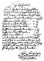
Final sentence of a comparison from the year 1750; contains both current and Latin script
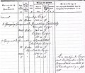
Sheet from a border protocol, late 19th century, near Buchholz (Nordheide)

Autograph by Wilhelm Busch (undated, around the end of the 19th century)
Example from a school notebook, 1910

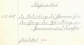
Document from 1917

Municipal children's home in Esslingen am Neckar (photo 2006)
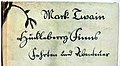
Book title from circa 1920: Huckleberry Finn's Rides and Adventures by Mark Twain


literature
- Hellmut Gutzwiller : The development of writing in modern times. In: AfD, Archive for Diplomatics, History of Writing, Siegel- und Wappenkunde 38 (1992), pp. 381–488.
- Tamara N. Tacenko: On the history of the German italics in the 16th century. Comments on the development of this font based on documents from a collection from St. Petersburg. In: AfD 38, Cologne u. a. 1992, pp. 357-380.
- Friedrich Beck : The "German writing" - medium in five centuries of German history. In: AfD 37 (1991), pp. 453-479.
- Heribert Sturm : Introduction to writing. Munich-Pasing 1955.
- Leo Santifaller : Bozener cursive fonts of modern times . Gustav Fischer, Jena 1930.
- Learning aids
- Kurt Dülfer, HE Korn: tablets on German palaeography of the 16th – 20th centuries Century , 2 parts, 6th edition, ed. by Günter Hollenberg, Marburg 1987 (publications of the archive school Marburg 2).
- M. Kobuch, E. Müller: The German peasant war in documents . Weimar 1977 (only suitable for the 16th century).
- Paleography course . Technical school for archives, Potsdam o. J.
- Harald Suss: German script. Learning to read and write , Droemer Knaur , 2002, ISBN 3-426-66753-3 (textbook for German Kurrent, Sütterlin script and Offenbach script).
- Paul Arnold Grun: Reading key to our old script , Limburg 2002 (reprint of the original edition from 1935), ISBN 3-7980-0358-0 (documentation of the development of scripts from the 14th to 19th centuries, with numerous script samples).
- Helmut Delbanco: Writing school for German writing. Instructions for learning German cursive handwriting , Verlag Bund für deutsche Schrift und Sprach, 2005, ISBN 3-930540-23-1 (learning and instruction booklet for German handwriting, also known as Sütterlinschrift).
- Karl Gladt: German written primer . Instructions for reading the Kurrent script of the 17th – 20th centuries Century , Graz 1976.
- Berthold zu Dohna: Why not German? Exercise book for German cursive writing. 4th edition. Christians, Hamburg 2001, ISBN 3-7672-1241-2 , 168 pages, with numerous illustrations.
- Johannes Seidl: Examples of writing from the 17th to the 20th century for learning the Kurrent script. Exercise texts from Perchtoldsdorf archives ( memento from March 19, 2013 in the Internet Archive ) (PDF file; 1.4 MB), 1996
Web links
- History of the German script
- First steps to current reading in the offer of the University of Vienna (PDF; 595 kB)
- Friends of the German Kurrentschrift
- Association for German writing and language
- Currencies to learn by yourself
- Margarete Mücke: Current script writing course. Retrieved March 12, 2018 .
Remarks
- ^ A b Karin Schneider : Paleography and handwriting for Germanists: An introduction . 3. Edition. Walter de Gruyter & Co KG, 2014, ISBN 978-3-11-037308-0 , p. 84 ( books.google.de ).
- ↑ Sonja Steiner-Welz: From the font and the fonts . Reinhard Welz Vermittler Verlag eK, 2003, ISBN 978-3-937636-47-4 , p. 111 ( books.google.de ).
- ↑ Sonja Steiner-Welz: From the font and the fonts . Reinhard Welz Vermittler Verlag eK, 2003, ISBN 978-3-937636-47-4 , p. 113 ( books.google.de ).
- ↑ Sonja Steiner-Welz: From the font and the fonts . Reinhard Welz Vermittler Verlag eK, 2003, ISBN 978-3-937636-47-4 , p. 123 ( books.google.de ).
- ↑ Standard writing of the RMfWEV of September 1, 1941
- ^ Albert Derolez: The Palaeography of Gothic Manuscript Books: From the Twelfth to the Early Sixteenth Century . Cambridge University Press, 2003, ISBN 978-0-521-80315-1 , pp. 188 ( books.google.de ).
- ^ Bernhard Bischoff : Latin Palaeography: Antiquity and the Middle Ages . Cambridge University Press, 1990, ISBN 978-0-521-36726-4 , pp. 135 ( books.google.de ).
- ↑ Organ designation so in 6 registers a subbass sabot in the pedal cleanly executed boxes and three bellows consists: Firstly a principal of good Zÿnn in 4 f - Schuech Anderns a copl of wood in 8 f - Third a flute of wood in 4 f - Virtens a fifth from metal in 3 f - fifth a super octave from metal in 2 f - sixth a double Mÿxtur in 1 f - Sibtens a subbass in 16 f - Schuech with all attendees carpenter and locksmith work from mier entbenenden nöb [en ] per 4 hundred fifty guilders ] 3 species Tugaten Leÿkhauf (3 ducats tip) without excessive expenses right is khan deformed and sözt. Johann Christoph Egedacher Hof organ maker in Salzburg . Quoted from: Roman Schmeißner: Organ building in Salzburg pilgrimage churches. WiKu-Verlag, Duisburg / Cologne 2015, ISBN 978-3-86553-446-0 , p. 148f.