
script

A script font, italics ( medium latin cursivus , flowing, commonly '), Kurrentschrift ( latin currere run') or ticker is a use font, by a continuous or difficult broken lines on a writing surface is characterized (usually paper). It has its origins in fluent (cursive) writing by hand . Here are writing instruments used, with which a continuous flow line can be generated today, for example, pencils, fountain pens, ballpoint pens, Fineliners, chalk or brush (mainly in Asia).
Cursive script is by no means to be equated with handwritten script: the uncials , the Gothic minuscule , the Textura , the Rotunda or the humanistic minuscule were (primarily) written by hand, but are not cursive. Conversely, there are also printed typefaces today , which are included in group VIII ( scripts ) in DIN 16518 because they imitate script.
The term cursive mostly refers to Latin alphabets since the European Middle Ages , as the printed and handwritten scripts have diverged considerably. The Latin script and the German cursive are script fonts for the Latin alphabet. But there are also scripts in alphabets other than Latin.
The art of legible handwriting, handwriting , was practiced and taught by typists in the Middle Ages . It later became part of general school lessons .
Features of cursive

The scripts have a special position within the scripts that are written by hand. They differ from other handwritten fonts in the strong influence that the rapid and fluid execution of movements exerts on the form. While statically structured fonts (e.g. book and representative inscriptions ) are created by juxtaposing individual molded parts or lines, cursive fonts are predominantly dynamic because they are executed at a higher writing speed. With them, the economization of the writing process and thus the shortening of the writing path play a dominant role. Characteristic features compared to other handwritten scripts are
- the predominantly single-line representation of the characters,
- the creation of connections / ligatures between letters within a word,
- the transfer of the directional contrast horizontally / vertically into the diagonal, among other things by grinding the shapes,
- the more or less clear inclination of the main axis of the characters.
Handwritten script, which consists of unconnected letters, is not cursive, but is called print script, in Switzerland also called stone script .
Development of script fonts in Europe
.jpg)
Italics have not always been common in the history of writing. While in Roman antiquity writing was used extensively in everyday life and a fluid, connected writing developed as a result ( older Roman cursive , younger Roman cursive ), the high Middle Ages did not have a font based on the principle of letter connection. Only since the 13th century, had written form so widespread by universities, merchants and centralized administration and again that a new italics, the Gothic cursive arose.
With book printing , it became possible for less well-off, schools and public libraries to acquire books. In the 15th century , the hand of writing was in direct, tough competition with the printing machine . The printers soon realized that they could sell books of the same type and quality in large numbers quickly and cheaply. The printers initially followed the example of handwritten books in terms of their types and the decorative accessories.
The progress of development and the rapid success of the art of printing forced the previously highly respected and well-paid book writers to defend the continued existence of their art from the steadily growing competition. They founded writing schools, accepted students from the bourgeoisie and continued to develop the fonts that have been tried and tested since then. They influenced the further development of handwriting as well as book fonts and thus promoted the spread of handwriting in general.
After the advent of the art of printing, there were large numbers of scribes in Germany, France, Spain, Italy, Switzerland and other countries. Between 1500 and 1800, around 800 printed writing templates were created in Germany alone.
As bedeutendster Nuremberg Writing Master applies Johann Neudörffer , a contemporary of Albrecht Dürer . He created the Neudörffer-Andreä Fraktur with Hieronymus Andreä . With this print he also laid the basis for all other Gothic fonts , which also influenced the cursive font used in the offices ( Kanzleikurrent , German Kurrentschrift ). In his school he went against the diversity and confusion of the traffic scripts used at the time.
In law firms and in everyday business life in Germany, the forms of the Gothic cursive were the starting point for the development of the so-called German script or German Kurrent script . In the 16th century, the humanistic cursive, developed by the humanist Niccolò Niccoli , became the accepted script for Latin and non-German texts . The humanistic cursive developed further into the Latin script , which is still used today. An educated resident of Germany learned to read and write at least two fonts fluently by the 20th century. In letters, the normal text was not infrequently written in German Kurrent script, while proper names or other words that had to be emphasized were written in humanistic cursive (or Latin cursive).
In 1941, following a decision by Adolf Hitler, the German Kurrent script was banned by a decree and Latin cursive script was declared the sole "German normal script". The German Kurrentschrift did not come into use again after the end of the Third Reich.
Special spellings

|

|
|
|
An arc above the small u (left) is used to distinguish it from the n (right)
|
||
In the current script, some letters can be unclear to read. To improve this, certain additional characters have been developed. For example, in the German-speaking world, it has become customary to draw a line or arc (ū) over the lowercase u in order to better distinguish it from the lowercase n . The double letters "mm" and "nn" were also often written as m̅ and n̅ with a reduplication stroke. The reduplication line fell out of use in the 20th century and U-bends are also rarely found today.
The letter O was sometimes given a “tail” or a curl to distinguish it better from the number 0 , the number 7 was given a horizontal line to better distinguish it from the number 1, and the letter Z was given a horizontal line ( Ƶ ) to better distinguish it from number 2. In the Anglo-Saxon language area, other conventions prevail, for example the omission of the upstroke in the number 1 to better distinguish it from the number 7.
Reforms and abolition of the German Kurrentschrift
.png)
In the year 1830, the pointed steel nib, starting from England, became more and more popular. It turned out to be more difficult to use than the keel spring, but it was also able to establish itself in Germany by the end of the 19th century.
With the introduction of compulsory schooling and writing as a basic subject, the various master schools soon became superfluous. With their elimination and the continued implementation of the English style together with the English pointed pen, new utility fonts prevailed.
In 1911, the graphic artist Ludwig Sütterlin developed the Sütterlin script , a reformed cursive script as a starting script in two versions, a German and a Latin alphabet. He designed them with a ratio of 1: 1: 1 for the ruled spaces, with cuneiform scripts. As a completely new device, he used the tension spring ( ball point spring ) and the cord tension spring (Redis spring) . The spherical tip of the tension spring enables round strokes of any kind with the same line thickness , and Sütterlin designed his initial font to match this property. The tension spring makes no great demands on the holding and guidance of the nib or the fountain pen . For this reason it appeared to Sütterlin as the right writing instrument for children to learn to write. In the case of a cord spring, instead of a ball, a small round disc rests on the paper. Because of its uniform line width, it is also often used for grotesque or technical fonts . But Sütterlin also spoke out very clearly in favor of the use of the right-angled broad nib , which was to follow in later school years, and pointed to the gain in form that this nib gives the writings. Sütterlin's reform writing was introduced in schools in Prussia in 1915. After his publication of the New Guide for Writing Lessons , which appeared in 1917, it was also introduced in other German countries and thus shaped the handwriting of Germans for many decades.

Sütterlin original font (German alphabet)
Sütterlin original script (Latin alphabet)


In Hesse, Rudolf Koch developed an expressive broad font , the Offenbach font , which he introduced in 1927. With the introduction of Sütterlin's script in Hesse in 1930, however, the Offenbach script remained unused.
Offenbach font (German alphabet)

Offenbach script (Latin alphabet)


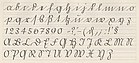
In 1935, the Sütterlin script became part of the official curriculum in a modified form (slightly inclined, less round shapes) as German folk script. In 1941, however, the National Socialist government's Ordinance on Normal Fonts sealed the temporary end of German cursive script. The Latin cursive was now set as "normal font".

German normal script, from 1941

Latin original, since 1953
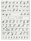
Cursive handwriting of the GDR from 1958


Contradictions in understanding cursive writing
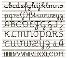
Since the 1960s there have been and still are efforts in the German curricula for learning to write to take back the flourishes taken over from the Baroque , especially the capital letters. The school exit script (1968) was mainly based on the sources of the Latin script , the humanistic cursive . In contrast, the efforts of the representatives of the simplified starting script (1972) were aimed at developing the script as a whole from the straight roman, the so-called printed script.
Since 2011, attempts have been made with the basic font to revive the ideas of Fritz Kuhlmann (1916). Kuhlmann was a passionate supporter of the work school principle. He advocated that the children develop the writing form themselves from the printed letter forms of the reading script and thereby find their own letters as well as letter combinations. This concept had not proven itself at the time and was abandoned. In its revived form of the "basic font" it does not necessarily aim at the development of a personal cursive script, it also allows the letters of a word to be printed individually. The design of loops in the ascenders and descenders is usually not necessary. The Primary School Association is committed to replacing the cursive scripts used so far with the basic script. The basic font is currently being tested in some federal states. Since autumn 2012, primary schools in Hamburg have been free to use the basic font or the original school font.
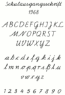
School exit document (GDR, since 1968)

Simplified original font (Federal Republic of Germany, since 1972)
Development of the Latin script according to Fritz Kuhlmann, 1916

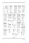
Austrian school script 1969–1995
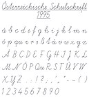
Austrian school font since 1995

One possible form of the basic font (not a standard font), 2011


Further development
In the age of PCs , tablets and smartphones , the use of handwriting in both professional and private life is increasingly being pushed back. The schools in the different countries have e.g. T. already responded to the trend. In Finland, for example, typing on the keyboard is to be taught alongside a basic font in primary schools from autumn 2016. A bound cursive no longer needs to be taught. In other countries, too, simplifications are being discussed or have already been implemented. In Germany, where school curricula are subject to the cultural sovereignty of the federal states, there are different regulations, whereby the decision is determined by the school curriculum of the respective school or z. T. also lies with the individual teacher.
The cursive script is predominantly considered to be important in the technical discussion. At the same time, serious difficulties in writing by hand are observed. In 2015, a survey found increasing problems in German schools with the use of cursive. The German Association of Philologists advocates cursive handwriting, because handwritten notes - although not necessarily handwritten - led to a better understanding and longer memory of learning content in a study by Princeton University and UCLA .
See also
literature
- H. Delitsch: History of the occidental forms of cursive. 1928.
- Rudolph Pophal: The handwriting as brain writing . The graphology in the light of the layer concept. Greifenverlag, Rudolstadt 1949 ( DNB 453821189 ).
- Dieter E. Zimmer : Handwriting and Cold War . In: DIE ZEIT / Feuilleton, No. 34, 23 August 1968, page 9, title "About scripts and politics".
- Eugen Nerdinger, Lisa Beck: writing, drawing. Basics of font display. Part 1; 9th edition. Callwey Munich 1984, ISBN 3-7667-0750-7 , pp. 106-108.
- Wilhelm Helmuth Müller, Alice Enskat: Graphological Diagnostics. Your basics, possibilities and limits. Huber, Bern a. a. 1987, ISBN 3-456-81631-6 .
- Martin Andersch: Comment on a comment. In: Helmut Schreier u. a .: writing and writing. Study unit. Project music and aesthetic education in elementary school 78. DIFF, Tübingen 1989. pp. 79–83.
- Michael Rau, Rosemarie Kloos-Rau: Script fonts . Ed .: Michael Rau. Bruckmann, Munich 1993, ISBN 3-7654-2572-9 .
- GS aktuell 91 (September 2005), pp. 3–12 (PDF file; 664 kB)
- Bernd Wehren: The script training - basic script . Persen, Horneburg 2013, ISBN 978-3-403-23277-3 .
- Gehum-Hee Hong: Brush'n'Script script collection . Hermann Schmidt, Mainz 2010, ISBN 978-3-87439-783-4 .
Web links
- History of the German script
- The time of March 24, 2011: Cursive: With swing, but legible!
- Jules van der Ley: A Brief Cultural History of Manuscripts (PDF; 478 kB), accessed on June 18, 2019
Individual evidence
- ↑ Werner Dietrich: Statistical investigations on the connection between writing characteristics. Inaugural dissertation Leipzig: Beck, Nördlingen 1937.
- ↑ Lexicon of the entire book industry : LGB / ed. by Severin Corsten with co-workers from Claus W. Gerhardt u. a., Vol. VI. Hiersemann, Stuttgart 2003, p. 604.
- ↑ Lexicon of Art - 4: Q – S. Seemann, Leipzig 1977, p. 393.
- ↑ see also: Escritura cortesana
- ↑ German language history from the late Middle Ages to the present . Walter de Gruyter, 1999, ISBN 978-3-11-014344-7 , p. 44 ( books.google.de ).
- ↑ On the script and the fonts . Reinhard Welz Vermittler Verlag eK, 2003, ISBN 978-3-937636-47-4 , p. 133 ( books.google.de ).
- ^ Elisabeth Neuhaus-Siemon: Aspects and problems of writing lessons. In: Hartmut Günther, Otto Ludwig (Ed.): Writing and writing. An interdisciplinary handbook of international research. 2nd half volume, Berlin / New York 1996, ISBN 978-3-11-019413-5 , p. 1243
- ↑ Peter Praschl: ... the end of the manuscript? In: Süddeutsche Zeitung Magazin , issue 06/2012.
- ↑ Representation of the basic font on the homepage of the elementary school association ( Memento of the original from August 13, 2011 in the Internet Archive ) Info: The archive link was inserted automatically and has not yet been checked. Please check the original and archive link according to the instructions and then remove this notice. (PDF; 1.3 MB)
- ↑ Ursula Scheer: Typing fluently is a national skill. In: Frankfurter Allgemeine Zeitung. January 14, 2015, accessed January 14, 2015 .
- ↑ Survey among teachers shows that problems with handwriting are increasing in school. German Teachers' Association (DL), April 1, 2015, accessed on April 14, 2015 .
- ↑ Negligent experiments. High school teachers warn of the decline in handwriting. Neue Osnabrücker Zeitung , April 14, 2015, accessed on April 14, 2015 .
- ↑ Andreas Wilkens: Association of Philologists advocates cursive writing. Heise online , April 14, 2015, accessed on March 28, 2018 .
- ↑ Dörte Saße: Learn better with a pen instead of a keyboard. Heise online , May 4, 2014, accessed on March 28, 2018 .