
colour

A color is a sensory impression conveyed by the eye and brain , which is caused by light , more precisely by the perception of electromagnetic radiation with a wavelength between 380 and 760 nanometers. It is the sensory impression through which two adjoining, structureless parts of the field of vision can be distinguished with one-eyed observation with the unmoved eye alone.
In everyday language, colorants (coloring substances) are also referred to as color, i.e. material means with which the color of objects can be changed, such as paints .
Color perception is a subjective sensation which is determined not only by the type of incident light radiation, but also by the nature of the eyes, the sensitivity of the receptors and the perception apparatus. Other optical perception phenomena such as structure (light-shadow effects), gloss or roughness, as well as psychological effects such as change of mood or adaptation , are to be distinguished from the color concept.
Literally color
Color (from Middle High German varwe "color, coloring") has several meanings of words.
- A visual sensory impression , the color.
- Differences in quality of this sensory impression.
- Color designation stands for the quality and quantity of this perception and classes of color impressions ( color names ).
- Light color describes the radiation from lights and spotlights, as in the case of colored shadows .
- Body color is the visual (color) impression that emanates from a body under the influence of light color.
- Colorant , within the meaning of "coloring agent" refers to substances mainly for color change, a body color cause (pigments, dyes and dye solutions, as well as coloring in a broader sense paint ).
- In terms of color design, color is a technical term used in painting and photography .
In other languages, a stronger distinction is made between the effect of color (“colored”) and the cause of color (“to dye”), for example in English color and dye (stuff) (or pigment ), or in the Romance languages ( Spanish : color and teñir ).
This article does not explain the origin of colors and the additional terms for color are dealt with under basic color .
perception
Color is what is perceived. It arises from the visual stimulus in color receptors in response to a color valence, just as a mechanical stimulus is caused by pressure or roughness. Color is not the property of an object or light seen, but rather a subjective feeling, the physical cause of which is the intensity distribution of electromagnetic waves between 380 nm and 780 nm. Different intensities in visible light trigger nerve stimuli that form different qualities of color perception , the coexistence of which is perceived as color.
The optical phenomenon of color perception is a research area of extensive complexity. Physical (spectrum), perceptual physiological (color stimulus) and perceptual psychological (color valence) as well as linguistic-conventional aspects are intertwined. The visual perception of humans occurs through receptors that are located on the retina : rods for light / dark contrast , the cones (not cones !) For color perception .
Cones are available in three forms, each of which has its maximum sensitivity in one of the spectral ranges “ red ”, “ green ” and “ blue ”. Color can be represented as a three-dimensional property due to the three types of color receptors in humans . Every combination of stimuli from the three types of cones through (light) radiation that hits the retina produces a specific color impression . Thus, black (no excitation at all ), neutral gray (equal excitation) and white (full excitation of all three types of cones) are also colors that are classified as achromatic colors.
Visible as light is electromagnetic radiation with a wavelength between 380 nm and 780 nm (visible part of the electromagnetic spectrum ). Spectral colors , as they occur when white light is refracted behind a prism, are spectra in which only a wavelength range of visible light occurs without any foreign components.
Basically, light and body colors differ. In the first, a source of lighting (sun, lights, screen pixels) sends colored light into our eyes . The laws of additive color mixing (red lamp + green lamp = yellow light) apply to the overall impression of several colored lighting sources. Body colors arise when incident light is partially absorbed on one surface of the body and partially reflected into the eye on the other. The laws of subtractive color mixing (magenta + yellow = red) apply to body colors and their coloring agents. Body colors depend heavily on the source of lighting, for example a green leaf appears black when illuminated with pure red light because it does not reflect any red components.
| term | Site of action | Type of action | Area of Expertise |
|---|---|---|---|
| Color stimulus | Light source | Transport of photons | Development of colors / optics |
| Color valence | Eye ( cone ) | Spectral-specific response of the retina | physiology |
| Color sensation | brain | Color perception | Physiology / Psychology |
Color impression of humans

Within a generic term color (colourfulness), color is also an expression of the criteria for distinguishing this quality. Grass is green, blood is red, a lemon is yellow. Clear glass is colorless (without its own color). This perception of a quality of a visual impression arises before the naming by words.
Words describe impressions: blue, deep blue, pale blue, sky blue, red blue. Color differences can be named and so it is possible to exchange perceptions. In addition to showing material samples, words can also be used to talk about colors (second signal system). This is based on the conventional agreement , shaped by generations and learned in childhood. The individual perception of (objectively) identically named colors can be quite different for different people. These individualities go up to the partial or complete failure of receptors, up to color ametropia .
Color names serve for a common understanding of the environment. There are also other non-verbal conventions: red is up at the traffic light and green is down at the traffic light. In addition, the color effect and the impression also influence color moods , the temporal and spatial prior effects, individual experience and training of perception. ( List of color names (category) ) ( sorted by frequency of mention )
In the sense of “color” in common parlance, there are group names for classes of sensory impression which, for example, describe an object property as “body color in daylight”. Such common, fixed color names can be found under
Color names
Color terms and color words
In all modern languages there are a large number of nuanced words for individual colors . Our need to name colors increases over time. According to a study from the 2010s, due to environmental influences, four-year-olds know as many color names as eight-year-olds did 100 years ago.
Sometimes color names that others have in one language are “missing”. Gaps of this kind can be filled by borrowing from other languages or by changing the function of existing object names. Examples of this are the late appearance of orange , pink , turquoise or magenta in German.
The word meanings are often subject to change due to social and cultural factors. If different languages divide up the color spectrum differently, as in Asian languages, this can lead to confusion in translations. Examples of this can be found at the discussion point of the blue and green tones. Individual languages can have their own (object-related) color designations for certain purposes: for example, blonde in German only applies to human hair , while fawn only applies to animal hair.
Since 1969, Anglo-Saxon linguists in particular have been concerned with the question of whether color terms (“basic color terms”) are part of a language-universal hierarchy of implications. In the influential 98-language study, Basic Color Terms, Brent Berlin and Paul Kay suggested that all languages in the world have a minimal occupation of two color categories in their vocabulary (i.e., color terms for white / light and black / dark). In addition, the third category is red, the fourth yellow or green and then up to a maximum of eleven basic color words. Berlin and Kay interpreted their findings not only as a language-typological phenomenon, but also as a historical development model with seven language stages (stages I - VII). This hypothesis has been tested since 2002 at the University of Konstanz, along with many other language typological working hypotheses, as part of the project The Universals Archive . Berlin and Kay's views met with criticism from ethnologists and language relativists and were subsequently modified by Kay and other language universalists. The exclusion of culture-specific factors, the Anglo-centric approach and the arbitrary, sometimes contradicting criteria for identifying the basic words were criticized. Aspects of the Berlin / Kay model (the concept of a limited inventory of basic color names) were often accepted by German linguists, but typically with significant modifications, such as Caroline Kaufmann. On the basis of twelve criteria specially tailored to the German language system, Kaufmann identified an inventory of only eight basic color lenses ( blue, brown, yellow, gray, green, red, black, white ), as well as eight intermediate color lenses ( pink, pink, orange, turquoise, purple, violet) , purple, beige ).
The emotional effect of color names is used by advertising for commercial products, as links to “appealing”, generally known objects or situations can be used here. The name Sahara as the surface color of cars is symbolic of longing or space, and Ferrari red is intended to awaken thoughts of performance and speed. Undoubtedly there is a symbolism of colors through culture, psyche and upbringing, which is sometimes expressed in proverbs and ratings. In this sense, color names also stand for feelings and vice versa.
The historical encyclopedia by William Jervis Jones offers a collection of color names and derivations with textual evidence for the documentation of German color names (including colorant names) in all language periods. The work consists of Volume I: Sources and Literature, Old High German, Middle High German, and Volumes II to V for Early New High German to New High German.
Color coordinates
Various national and international standards and quasi-standards exist for the color display on technical systems , for example the “ web colors ” as part of the CSS-3 specification issued by the World Wide Web Consortium . Color catalogs with color representations offer a connection between color names and two-dimensional color representation, such as the HKS color system or, for the German-speaking area, the RAL color catalog . The Pantone color system is not so widespread in Germany, but still in use .
As described in the Perception section , a color can be represented as a three-dimensional property. Therefore, technical color specifications are usually given as 3- tuples in a color space ; accordingly there are often three basic colors or primary colors on which the respective color space is based. Information on such color coordinates, as the color location , is not very clear, is necessary and unavoidable for technical applications (for example, tolerance information in contracts). This is the only way to convert “color” and make color management possible for the first time.
| Color space | meaning | Purple, rendering and color locus |
|---|---|---|
| RGB | Red, green, blue | {r = 128, g = 0, b = 128} |
| CMYK | Cyan, magenta, yellow, black | {c = 66, m = 87, y = 0, k = 0} |
| HSV / HSB | Hue (hue), saturation (saturation), light value (value / brightness) | {h = 300, s = 67, v = 44} |
Specifying three color coordinates alone does not mean anything unless the associated color system is specified in order to make understandable statements. This relationship must be observed especially in the case of a device color space, i.e. for the special (individual) device. The three bars look the same on the same screen, so the color (red, green, blue) = {# 800080} for a purple in the RGB system seems to be sufficiently defined. When viewing the color stimulus generated in this way on different monitors (standing next to one another), the bars appear differently, especially if the monitors are not calibrated . The graphic below can be used to check the monitor used to view this article and its settings . On LC screens, even the viewing angle often changes the perceived color impression.
Light color
Light is necessary for color to be perceived. This arises from the heat movement of molecules or atoms or from changes in the energy levels of the electron shell of atoms.
Body colors
Body color is the visual perception of objects that is reflected by specific changes in the remitted spectrum due to absorption of substance-specific wavelengths of the optical radiation or by scattering from the surface . In painting, the term object color is used and, in the special case, local color as a contrast to the overall tone. The structure of the surface can also give rise to a physically based coloration ( structure colors ), such as the shimmering spots on the wings of a butterfly.
Psychological effect
If light of a certain light spectrum irritates the eye, this has more complex and color-specific psychological effects in the central nervous system in addition to the simple sensory perception (such as “cherry red”, “sky blue”).
People of the same culture have a lot in common through tradition and upbringing, but there are also individual differences. Such psychological effects of color perception are used - intuitively or consciously - for effects in artistic design as well as in the fashion and advertising industries. Psychological color tests help to achieve the desired effect. Color perception has the same effect on the psyche as other impressions. Unusual coloring can highlight or hide details and thereby irritate.
From psychological color tests such as the Lüscher color test , it is claimed to be able to infer the personality of the test person from the preference for certain colors and color combinations. More generally, color tests should provide information on how a personality reacts to which colors. Numerous studies have never supported these claims. Psychological color effects are accepted in many cultures, which is reflected in proverbs and sayings . Findings from this are used in advertising in a targeted manner.
Cold or warm
Experience can result in certain relationships to the colors, as is the case with the perception of temperature.
- Warm colors : The warm season is determined by the yellow and red tones; open fire has these colors due to glowing carbon particles. From experience and tradition, the color tones from yellow-green to purple-red are considered "warm".
- Cold colors : the cold, blue water, the turquoise shadows of ice in winter and on icebergs, the “poisonous” blue-green have a repellent and cool effect. Color tones that are opposite the warm colors in the color wheel are perceived as "cold" and are accordingly called cold colors.
Goethe's color theory , for example, is based on this . This relationship must not be confused with the physically defined color temperature of light sources. In addition, it is subject to individual and cultural differences in color perception. Blue is usually considered a cold color, but was classified as warm in the Middle Ages and associated with the Virgin Mary , for example .
The visual system


The way the visual system works in the central nervous system and especially in the brain in interaction with the emotional center is still unexplored. On the other hand, the perception of different wavelengths in the cones and rods of the retina is not solely responsible for the creation of the perceived image. The process of seeing the color and shape of an object is also characterized by the fact that the cerebrum connects a sensory impression with an associated memory. The perceived color of an object is not always comparable with the metrological (since physical) one. Rather, the perceived image of the information currently recorded is covered by the knowledge of this object.
In psychology , the term memory colors is naturalized when it comes to color perception. Objects with a typical color tone are perceived with recourse to the prototypical color tone stored in memory . Tomatoes are perceived as being a more intense red than what they actually look like. A meadow appears green even at dusk. The blue sky is also such an education, for the Romans the sky was "light", in the sense of light.
In colorimetry , this individualization can lead to difficulties, since two physically identical colors are not necessarily assessed equally by different people.
The perception of colors works psychologically in two ways.
- Color evokes associations , i.e. ideas, mostly memories, of things like red = fire, green = grass, yellow = lemon. Further examples can be found in the table.
- Color evokes feelings (color feeling, feeling tone, quality of impression, feeling character). These are expressed when nouns are transformed into adjectives or when adjectives are used from the outset that are most likely to express feelings, red = dangerous, green = poisonous, yellow = fresh. Color can activate past experiences on the emotional level.
Associations and feelings as a result of color perception go into the traditions of the culture in the respective folk area. According to the "empirical theory of the emotional effects of colors", color feelings are learned individually and implicitly (unconsciously, not rememberable): These are above all feelings that humans originally have in relation to certain ubiquitous "universal objects" or "universal situations" due to inherited instinctual structure and the issue of existence developed.
- Universal objects: blue sky, clear water, green vegetation, red fire, red blood (“as the sap of life”), yellow sun, brown soil, brown to gray faeces, gray rocks, black remains of fire.
- Universal situations are those in which humans find themselves every day: dark (black) night, bright (white) day.
Because experience and upbringing give these emotionally charged things a certain color (from the culture), people develop feelings when they perceive the color alone. The reaction to the color is then already imprinted: red alarms, even if the supposedly associated fire is missing and only the wall of the room is painted bright red. This corresponds to the learning of conditioned reflexes in Pavlov's dogs through classic conditioning .
History of colors
Color is a striking property of a fabric. This visual quality, which is common to all primates, was already known to Stone Age people . Proof of an active perception are the Stone Age cave drawings in which people have reproduced the 'seen' color of nature in their own creation with different dyes.
Craftsmanship requires the reproduction of color models, religious views on nature led to philosophical considerations about this material property and light phenomena. The first remarks of this kind can be found in classical China, in ancient Near East and especially in ancient times. The shiny yellow of the material gold, the substance of the gods, the reflection of the sun led to the desire to recreate this. Attempts by metalworkers and philosophical approaches to changing materials based on theories of the elements promoted the desire to produce expensive pigments differently and cheaper in the same "color". In particular, "reproducing" the "beautiful" but expensive gold according to its "visible" property - the color - became the basis and driving force of alchemy , the hermetic art.
Theories and doctrines of color, like any science, developed in conflict. For Democritus , the red particles were pointed and the green ones were round.
The studies and views of Johann Wolfgang von Goethe , supported by Philipp Otto Runge in his counter-view to Isaac Newton, had the greatest impact in the German-speaking area . Mention should be made of Hermann von Helmholtz , Ewald Hering , Wilhelm Ostwald and also Johannes Itten or Harald Küppers . The educational aspect of "advice on color use" is present in all of the items listed.
In the beginning, natural substances were the basis for colors, in the sense of dyes , for color design . Ultramarine blue was obtained from very expensive (because it is rare) lapis lazuli powder. The vat with indigo was used to dye fabrics blue . Purple from the secretion of the purple snail was the dye for emperors and kings. Red came from the cochineal scale insect. Soils were used for brown, yellow and red tones. Representative are Umbra to name and the Terra di Siena (Sienna) from Italy. White was extracted from lead as white lead. Soot was a suitable pigment for black, and there was a special craft for the difficult blackening of fabrics: the guild of black dyers. Gold had a metaphysical meaning in Byzantine and Western medieval painting.
In the 19th century, the color palette was expanded to include new inorganic dyes and pigments. Berliner or Prussian blue , Rinmans green , Schweinfurt green . The possibilities of dyeing have been expanded through the imitation of rare natural dyes in large quantities, industrial processes or newly created innovations.
The number of available coloring agents has been increased considerably by the organic aniline colors ( tar colors ). The natural pigments and dyes could be replaced by synthetic colors for the growing needs in art and business. The old names with regional references were partially retained. Naples yellow, Venetian red, Veronese green are examples of this.
In the 20th century, color photography and color printing expanded the possibilities of reproducing natural originals beyond the "color volume" of paintings or artistic graphics ( hand coloring ). Since then, research has been carried out into the laws of exact color reproduction . The development in color television and digital photography in turn allowed improved color reproduction of natural colors, but viewing habits also changed and required better color simulations . Problems in converting the colors of an original from a scanner to large format for advertising purposes are being perceived anew through “color training” among the general public.
Due to the increasing demands of consumers on color rendering, the new technical possibilities and the research results, the "measurement" of the physiological variable color developed into colorimetry .
The International Association for Color has existed since 1967.
Color models, color catalogs, color measurement
Color models
Various color models have been developed in which colors are described quantitatively (with the help of numbers) without the need to understand the triples of numbers with sensations. The specification (L = 75, a = 5, b = 33) does not explicitly evoke a perception of a color. In the color model, each contained color is represented as a point within a (often) three-dimensional color space - the maximum extent of which depends on the purity of the respective basic components. The models are conditioned and limited by the application, their color space should include all colors possible in the respective technology. In the event that different color reproduction techniques are used in a color workflow , these can only be converted into one another to a limited extent. In some cases, non-linear relationships are possible, but mostly they are matrices with interpolation points, between which linear interpolation must then be carried out. Different color spaces are not congruent - the colors can therefore often only be reproduced relative to one another, but not absolutely identically. The most important case is the mapping of the RGB color space (colors designed on the monitor) to the CMYK color space of the printing colors.
The CIE-Lab model is different, which is based on studies of human color perception, so that it contains all colors that can be perceived by humans. This is why “Lab” is often used in color reproduction as a reference color space, via which the other color spaces are defined.
- Some color spaces
- RGB - basic colors: red, green and blue in proportions
- CMYK - components: cyan, magenta, yellow (yellow) and black (key)
- HSV values: hue (hue), saturation (saturation) and strength (value)
- CIELab - basic values: L (lightness) and the abstract values a (red-green) and b (yellow-blue)
- XYZ : CIE / IBKCIE initial color body (standard color space )
- YUV (analog PAL and analog NTSC ), YDbDr in analog SECAM , YIQ obsolete, formerly used for analog NTSC
- YPbPr (analog HDTV and analog component video )
- YCbCr (digital PAL / SECAM , digital NTSC , DVB , JPEG , MPEG , DVD-Video )
Color catalogs
In addition to these mathematically defined (continuous) color spaces, there are sample collections that contain material samples of defined color tones. Depending on the industry, these are issued as folders, individual samples or color fans. Examples are:
Conversion between color collections
In a neutral color definition (such as CIELAB, sRGB), color values and catalogs can be mathematically compared with one another. It should be noted that the color range ( gamut ) of the model is sufficiently large, otherwise out-of-gamut color tones must be projected onto it. Since the CIELAB color space does not have a restricted gamut, but rather contains all possible colors clearly defined, color comparisons in CIELAB make the most sense. Due to the perceptual definition of CIELAB, the color differences (Delta E) calculated with this are also more meaningful than with RGB calculations.
Evaluation of color changes
In order to be able to evaluate changes in colors, standardized gray scales are used in various branches of industry .
Mixing colors
If a large number of different colors is to be produced, the desired color is usually mixed from a small number of basic colors. Often, three basic colors are sufficient, which, however, are usually not available in real practice (as a dye or light).

- Additive color mixing : starting from black (all basic colors are missing, i.e. 0% each), the resulting color becomes lighter the more basic color is added. With suitable basic colors, light-white can be achieved in this way: this is how computer monitors work, for example . Typically, red , green and blue are mixed in different proportions ( RGB ).
- Subtractive color mixing : Based on a defined frequency spectrum (e.g. uniform white), the resulting color becomes darker the more frequency components are filtered out, e.g. B. by pigments or color filters, which swallow the frequency components and are considered in their effectiveness as a basic color. If all frequency components in the visible spectrum are filtered out, the resulting color is (ideally) black . Printers , for example, work on this basis . Typically, the primary colors are here Cyan , Magenta and Yellow (dt. Yellow), shortly referred to as CMY. Usually black is added ( CMYK ). The K stands for Key plate and is added to increase the contrast and to be able to print a deeper black.
- The integrated mixture was suggested by Küppers in his color theory in order to observe the scatter factor of body colors more realistically, which is ignored in the usual form of subtractive color mixing. In addition to the absorption of the paint layers, the scattering in real surfaces influences the color; the Kubelka-Munk function provides a theoretical consideration and a computational approach . Küpper's integrated color mixing includes both additive and subtractive color mixing.

Additive color mixing with red, green, blue lights

Subtractive color mixing with magenta, cyan, yellow colorants
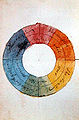
Color circle by Goethe, original: Free German Hochstift - Frankfurt Goethe Museum

The rhombohedron (color body) of the theory of colors according to Küppers

The color cube of the RGB color space and the CMY space


Spectral and mixed colors

- Spectral color
- is the impression created by the stimulus of a section of the visible spectrum. A suitable method for this is the decomposition of white light using a prism or a diffraction grating. The intensity and the impression of the spectral color depends on the width of the wavelength interval, i.e. also the purity of the spectral color. On the other hand, the individual wavelengths of the spectrum in visible light only represent a small part of possible colors . It should be noted that the spectral colors can be seen in the rainbow, but not their mixtures. Especially colors of the “ purple line ” between violet and red cannot appear as spectral colors, they are valence colors .
- Mixed colors
- are all color tones that result from color mixing , regardless of whether this is done by mixing rays (screen) or illuminated reflective surfaces (printed matter). Certain mixed colors can appear identical to the human eye due to metamerism , although the intensity of the irritating light is unequal at different points on the wavelength scale. Metamerism is in turn dependent on the source of illumination, this effect is due to the fact that the (quasi-continuous) spectrum of the radiation striking the eye (color stimulus) is mapped onto only three perceiving types of cones .

- Optimal colors
- are idealized spectral colors according to Wilhelm Ostwald with a finite width of the interval of the wavelength, for which only the intensity 0% and 100% exist. An optimal color is a body color whose reflectance curve β (λ) is a right-angled curve, only degrees of reflectance β (λ) = 0 and β (λ) = 1 are permitted and a maximum of two discontinuities in the visible area. There are only four optimal color types:
- Short-end colors (short-wave side is 1): blue
- Long-end colors (long-wave side is 1): red
- Middle color (no remission at the long- and short-wave end): green
- Middle- wrong color (remission at both ends 1, but no remission in the middle): Veil , the purple colors.
- The explanatory color name (attached) is for explanatory purposes only and is to be understood depending on the width of the range of full remission. A long-end color that almost reaches the short-wave end of the visible spectrum is a brilliant white with a blue cast, the same applies to the other types. On the other hand, only a narrow strip of a central color is black, at best black with a color cast .
- Color representation on different media
- An approximate "representation of colors" can be found in the respective article. A representation of spectral colors on the monitor is only approximately possible due to the different generation of radiation and the associated unequal spectral distribution. Please refer to the note at the end. An approximate assignment of spectral colors to sRGB values can be found under web links .
Hue, brightness, chromatic and achromatic colors
- Everyday language reproduces black and white as "colors", but does not describe them as colored . The term achromatic colors is sometimes used to define the neutral gray scale.
- Between the color cast and the saturation lie the bright colors , which leave an increasing color (i.e. chromatic) impression.
This distinction is based on color perception .
- Receptors for perception are the cones that exist in the human eye in three perceptual qualities. Depending on the energy of the incident photons (according to the optional wavelength), an electronic stimulus is activated by a chemical reaction, which is sent to the optic nerve . From the ratio of the different stimulation of the three receiving cones we perceive a wavelength of the same color , the color . Depending on the intensity distribution of the stimuli, we perceive the colors as saturated or faded. This original signal is used in the three-color theory . Of herring on the other hand comes the four-color theory , the counter-color pairs "green-red" and "yellow-blue" runs out and the rather led by the optic nerve and perceived in the cerebrum relationships describes as the outside of the body-to-find physical situation. Gray , white or black result as perceptions when all 3 cones are excited in almost the same quantity, i.e. there are no significant differences in nerve signals. The color dimensions of color intensity and color saturation are therefore due to the strength of the stimuli. Ultimately, these relationships can be formulated as the law of vision .
- The rods are more sensitive to light than the cones. When the amount of photons per unit of time decreases, only the rods are excited and their stimulus is carried on in the optic nerve. In weak light conditions ( night vision ), in which the colored cones do not trigger any stimulus, only information about the illuminance is sent to the brain . This information is in the original sense of the word “colorless” ( dark ) , a “gray” impression is created ( all cats are gray at night ).
- If the amount of incident photons falls below the perception threshold of rod cells as well, the impression arises “black” (in the sense of darkness ) , physiologically better known as self-gray .
- Excessive brightness (when shining or when looking into the sun), i.e. a high number of photons, overexcites both visual systems through glare . The “dazzling” white causes pain as a warning reaction of the body. Since the visual purple does not recombine quickly enough, intense glare can cause temporary blindness.
It should be noted that the development of the cones and rods go back to the same light-reacting original cells. This development led to the fact that the spectrum of perception of other animal species deviates from that of humans. Bees are better equipped in the ultraviolet, their visual cells perceive shorter-wave radiation (higher-energy photons) than humans. In birds, the perception of contrast between red fruits and green foliage has proven to be more important. Better perception of short-wave radiation is necessary for fish, since longer-wave parts of sunlight are absorbed by water.
- Color vision of animals
To speak of “color” with regard to the animals' vision is only possible in the sense that light is registered differently depending on the wavelength.
The complex nature of the color phenomenon is ultimately also the basis for different levels of abstraction and apparently contradicting statements. An example of this can be found under purple line .
- Physical consideration as the wavelength of light (energy of the photons),
- Three-dimensional color stimulus through the effect on the cones (three-color theory), which leads to 3 primary valences in the CIE standard color space .
- Complex effect of the perceived color in consciousness, which is represented as a Lab color space with equally spaced colors in color theory.
- The interpretation of the perceived color and its effect on the psyche and through: color theory , harmony, color analysis .
literature
- Harald Braem: The power of colors , Langen / Müller, Munich 2003, ISBN 3-7844-7156-0 .
- Hajo Düchting: Color at the Bauhaus. Mann, Berlin 1996, ISBN 3-7861-1667-9
- Hans Gekeler: DuMont's handbook of color (systematics and aesthetics). DuMont, Cologne 1988, ISBN 3-7701-2111-2 .
- Rolf Gierling: Color Management . MITP, Bonn 2006 (3rd edition), ISBN 3-8266-1626-X .
- Johann Wolfgang von Goethe : On the theory of colors . Cotta, Tuebingen 1810.
- Eva Heller: How colors affect emotions and mind . Knaur, Droemer 2000, ISBN 3-426-27174-5 .
- Johannes Itten : Art of Color , Otto Maier, Ravensburg 1970, ISBN 3-473-61551-X .
- Friedrich Kobler, Manfred Koller: Color of Architecture , in: Reallexikon zur Deutschen Kunstgeschichte , Vol. 7, 1975, Col. 274–428, in particular Col. 282 ff.
- Harald Küppers : The logic of color. Theoretical basics of color theory. Callwey, Munich 1981 (2nd edition), ISBN 3-7667-0601-2 .
- Marina Linares: Everything you need to know about colors. The Blue Owl, Essen 2005, ISBN 3-89924-147-9
- Narciso Silvestrini, Ernst Peter Fischer: Color systems in art and science. DuMont, Cologne 2005, ISBN 3-8321-7203-3
- Horst O. Mayer: Introduction to perception, learning and advertising psychology . Oldenbourg, Munich 2005, ISBN 3-486-57675-5 .
- Emil Ernst Ploß: A book of old colors. Technology of textile colors in the Middle Ages with an outlook on solid colors. Heidelberg and Berlin 1962, reprint: Moos, Munich 1977 (4th edition), ISBN 3-7879-0064-0 .
- Petra E. Weingart, Rudolf Forster (ed.): I and the color are one . Kovac, Hamburg 2005, ISBN 3-8300-1813-4 .
- Norbert Welsch, Claus Chr. Liebmann: Colors. Nature, technology, art. Spektrum, Munich 2004, ISBN 3-8274-1563-2 .
- Gudrun Wolfschmidt (Ed.): Colors in cultural history and natural science . Tredition, Hamburg 2011, ISBN 978-3-8424-2200-1 (book accompanying the exhibition in Hamburg 2010–2012; = Nuncius Hamburgensis - Contributions to the History of Natural Sciences ; Volume 18).
Web links
- General
- See, measure and reproduce colors - by Dietrich Zawischa
- Color systems in art and science
- Color names: test your own knowledge
- Color and Vision Research Labs: Color values, spectral values and tristimulus values , UCL
- Color definitions divided by shades
- Review article
- Eric M. Rubenstein: Entry in the Internet Encyclopedia of Philosophy .
- Barry Maund: Entry in Edward N. Zalta (Ed.): Stanford Encyclopedia of Philosophy .
Individual evidence
- ↑ a b DIN 5033 . In: German Institute for Standardization e. V. (Ed.): Colorants 1 . 7th edition. DIN-Taschenbuch 49.Berlin, Vienna, Zurich 2012, ISBN 978-3-410-23202-5 , pp. 4 .
- ↑ DIN 55943 . In: German Institute for Standardization e. V. (Ed.): Colorants 1 . 7th edition. DIN-Taschenbuch 49.Berlin, Vienna, Zurich 2012, ISBN 978-3-410-23202-5 , pp. 509 .
- ^ Lorenz Dittmann: The art of Cézanne, color - rhythm - symbolism . Böhlau Verlag GmbH & Cie, Cologne 2005, ISBN 3-412-11605-X , p. 45. For the history of the word Kolorit in German, see William Jervis Jones: Historical Lexicon of German Color Designations , Akademie Verlag / De Gruyter, Berlin 2013.
- ^ Study by Martin Oswald from the Pedagogical University Weingarten. Lecture at the conference "Color in Education", German Color Center and University of Halle-Wittenberg
- ↑ For the long debate between language universalists and relativists with regard to color naming see the article Linguistic relativity and the color naming debate on the English language Wikipedia: en: Linguistic relativity and the color naming debate . Critical comments on this complex of questions can be found in two German-language monographs: Beat Lehmann: RED is not "red" is not [red]. A balance sheet and reinterpretation of the linguistic theory of relativity . Tübingen, Narr 1998. In addition Iwar Werlen: Sprachliche Relativität. A problem-oriented introduction . Tübingen, Basel, Francke 2002.
- ↑ Basic Color Terms. Their Universality and Evolution . Berkeley, Los Angeles 1969, University of California Press.
- ↑ typo.uni-konstanz.de
- ↑ On this Lehmann: Rot . 1998, p. 172ff. Detailed criticism can be found in John A. Lucy: The linguistics of "color" . In: CL Hardin, L. Maffi (Ed.): Color categories in thought and language . Cambridge 1997, Cambridge University Press, pp. 320-346) and Barbara Saunders: Revisiting basic color terms . In: Journal of the Royal Anthropological Institute . 2000/6, pp. 81-99.
- ↑ Caroline Kaufmann: On the semantics of the color adjectives pink, pink and red. A corpus-based comparative study based on the color carrier concept . Diss. Munich 2006, online
- ^ William Jervis Jones: Historical Lexicon of German Color Designations . Akademie Verlag / De Gruyter, 2013, online in Google book search, ISBN 978-3-0500-5953-2 .
- ↑ W3C TR CSS3 Color Module, HTML4 color keywords
- ↑ pink light to emphasize acne
- ↑ Blue light in toilets ( memento of November 24, 2011 in the Internet Archive ) to make it more difficult for drug users to see the veins
- ^ TWA Whitfield, TJ Wiltshire: Color psychology: A critical review . In: Genetic, Social & General Psychology Monographs . Vol. 116, No. 4 , 1990, ISSN 8756-7547 , pp. 387 ff .
- ↑ Reinhard Federmann: The royal art (A history of alchemy). Paul Neff, Vienna Berlin Stuttgart 1964, without ISBN
- ↑ Gerd Boßhammer: Technological and color recipes from the Kassel Codex medicus 4 ° 10. Studies on the professional sociology of the medieval lay doctor. (Medical dissertation Würzburg), Königshausen & Neumann, Würzburg 1977 (= Würzburg medical historical research. Volume 10).
- ↑ Harald Küppers: The logic of colors , Callway: 1981, ISBN 3-7667-0601-2
